As devices with sharper, higher resolution screens (Retina, 4K, Ultra HD, and so on) become widespread, user expectations for graphics on the web are increasing. While the amount of time and effort it takes to make a website “Retina ready” can vary considerably based on the complexity of the layouts and CMS, the basic techniques your web developer will employ are pretty straight forward.
There are two different methods for generating an image on a computer screen, vectors and rasters. Both have advantages and disadvantages, and with the right mix of both, it’s possible to build a really nice experience.
Vectors: Compact Files for Icons & Logos
A vector, if you recall physics (or have listened to/watched “Despicable Me” hundreds of times as a parent like I have), is a numerical value with both direction and magnitude – think of telling someone you’ll be driving north at 60 MPH. In a visual context, vectors can be used to create intricate images – think of telling someone to move their paintbrush up the canvas six inches, to the left two inches, and so on. Think of a vector graphics file as a set of instructions, a recipe, for drawing an image.
Generally speaking, vector graphics lend themselves very well to content with lines and forms built of solid color – think of logos, old-school clip art, and computer icons. If you’re reading this post on the Sarah Lynn Design blog, the logo in the upper left and the social media links in the lower left are all vector graphics.
Vector graphics are great because you can make them very, very large (as in zoom in very far) and they’ll still look great; this is very advantageous for us – vector graphics on a website will look great on a high-resolution display.
Another vector advantage is that you can style and manipulate them easily with CSS (the computer instructions web developers write to control the visual layout of a web page), so, for example, you can change their color when a mouse hovers over and clicks them.
Rasters: Fat Files for Photos
The other way of building an image is a raster, in which you fill a grid with different colors – think of coloring in the squares on a sheet of graph paper. Each of those dots or colored cells is called a pixel.
While vectors are great in web design for logos, text, and icons, rasters are needed for photos (as in images from a camera). As a raster image gets bigger, it takes more data to store it – the color of each pixel needs to be saved; a bigger image needs more pixels.
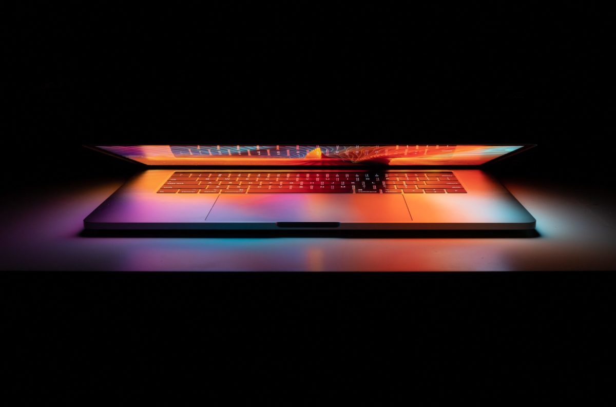
A disadvantage with raster images is that they don’t scale up very well – if you have a small raster image and stretch it larger, it will look soft, blurry, or fuzzy. In the context of a 4k or Retina display, normal raster images look a bit soft.
How do we get sharp graphics on a high-resolution display? Vector graphics are easy – our web browser can just double the sizes in the digital image recipe and get a bigger image that looks great (just as you can double the ingredients when you make cookies to get a double batch). Raster images are trickier though, as a bigger raster image needs more pixels.
Responsive Images: Device Appropriate Graphics
The solution for raster images is a technique called “responsive images.” In a nutshell, your CMS (content management system – Craft CMS, ExpressionEngine, WordPress, etc.) creates several different copies of each image that should be displayed on the website, and then sends the most appropriately sized image to your device.
For example, a website using responsive images to display a big hero, or splash graphic across the top of a page might send a small, 320-pixel wide copy of the raster to your old iPhone, but a ginormous 2,560-pixel wide copy to your 4k desktop computer. The content will look great on both devices, and the iPhone user won’t get bogged down waiting to download the huge image that the user on the high-end computer needs.
To summarize, vector graphics are great for icons and logos, are high-DPI out of the box, and can be easily manipulated by CSS. Raster graphics are needed for things like photos, but need responsive image support from your CMS in order to look great on a high resolution display.