If you are concerned about making your website multi-device friendly and reaching a much wider audience, responsive design is the best option. To be frank, all websites should be responsive. The term responsive will likely dissolve and the idea of making a website that doesn’t take into account the hundreds of thousands of devices on the market will be unheard of.
Here’s why…
The Web is Everywhere
To ignore the millions of people across the globe that only have access to the internet from a smartphone or tablet device is absurd. Personally I have met a few people, under 30, whose only way of accessing the internet is through their phone and that is right here in Eau Claire, WI on perfectly adequate salaries to afford a laptop or desktop computer. These are the people many business owners assume have desktop computers or are savvy enough to just “deal” with their desktop focused website on their phones.
Quit making assumptions about how people will use your website and look at the hard facts.
Read about some brands that have reaped the rewards of responsive design.
Responsive Design is Too Expensive
It doesn’t have to be. Yes going through a full re-design for the sake of making your site multi-device friendly will be an investment. There are a number of other ways to go about retrofitting your current site a little at a time. Start by testing out some different designs on pages that may not get very much traffic and implement the changes slowly to more highly visited pages.
Or you could start implementing media queries for the smallest dimensions first and move towards desktop & larger screens. It doesn’t have to happen all at once if you can’t afford it. It is an on-going process that will require new ways of thinking about website updates, but also one that pushes you
Think about the number of people your website will reach that you didn’t have access to before.
The cost of not reaching those audiences can be more damaging then the upfront costs of developing a multi-device experience.
Responsive Design is NOT a Replacement for Native Apps
There are some non-believers in responsive design and yes there are challenges that face everyone with the number of devices on the market today.
Responsive design isn’t meant to be an end all solution. There are reasons why you would want to do an app in addition to your website. Say for example, you have a bank that offers a check deposit app. Since this is something that is meant as an enhancement service, an app may very well be the best solution in addition to their website. Or the bank could try and take advantage of new web technologies such as HTML5 which can allow a web browser to take advantage of a built-in camera, a key component in building a mobile deposit service.
Then that so-called enhancement service can be used by any web user, not only those with Android or iPhone specific apps available to them.
Performance & Responsive Design
Most importantly, I turn my focus to performance. I chose to include this last because this is where we have historically placed performance issues. But I want to make a point of stating that it should not be last in our minds anymore. The number one downfall when non-believers speak about responsive design is when it comes to performance.
Have you tried loading a desktop website on your smartphone that isn’t responsive? How does it compare to a responsive website that hasn’t been optimized well for performance? There isn’t much difference. Compare that to a smartphone sized mobile website which is likely lacking half the content that resides on the desktop site, if not more.
Responsive websites are only slow if they are designed to be slow.
The design process needs to change to a multi-device mindset. Content strategy is where you should start. If you wouldn’t put it on a small screen then it doesn’t belong on the desktop site either. Small device users do like photos too however but they shouldn’t be punished for the poor connection they might be using to view your website. Responsive image solutions have been constantly discussed and a lot is being done to serve up smaller images to small devices. But that doesn’t account for a slow network connection.
With so many factors at play, we can’t simply focus on the size of the device.
Here are some responsive image resources for you to check out. It’s great to see so many developers and web pros thinking to the future and working hard to solve these challenges.
Responsive Image Resources
Responsive Images: How they almost worked & what we need
Responsive Img (jQuery solution)
Responsive Images Community Group (long-term solutions in the works)
Check out this great list of responsive resources curated by Brad Frost including performance articles about how to handle responsive images.
Responsive design might be new, scary, challenging, expensive, limiting & slow, but only if we make it that way. Do you remember what websites looked like circa 1995? We’ve come a long way since then and just as web technology evolved then, it will evolve now and into the future.
We will make it & for the better.
The only way to advance is to try, fail and keep trying until we succeed.
So is Responsive Design Right for You?
If you haven’t gathered by now, responsive design is right for everyone. To reach the largest number of people you have to be multi-device focused. Take it one step at a time and develop a plan or process that is right for your current website. It doesn’t all have to happen today or next year. But you should be thinking about all those users that want to enjoy the content you have to offer them but can’t because you aren’t giving them a good experience.
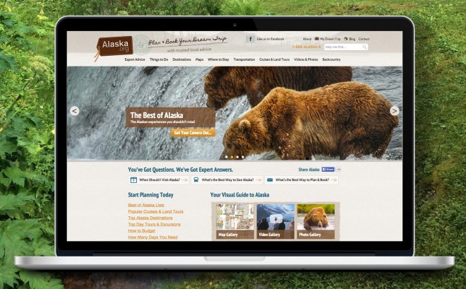
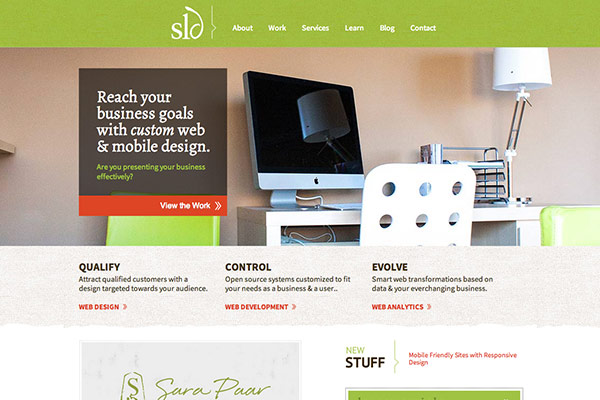
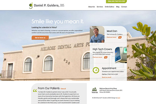
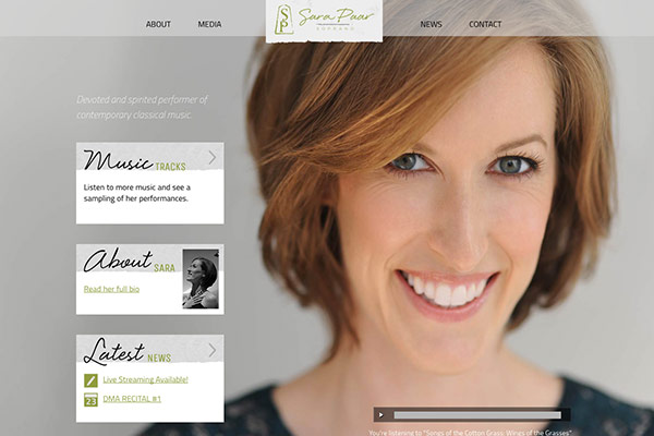
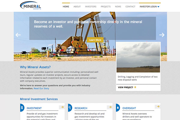
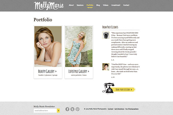
Examples of Responsive Websites [By SLD]

Related Responsive Design Articles
Steal These Website Ideas for Higher Traffic & More Sales