Top Website Design of the Week
Gene’s Sausage Shop & Delicatessen
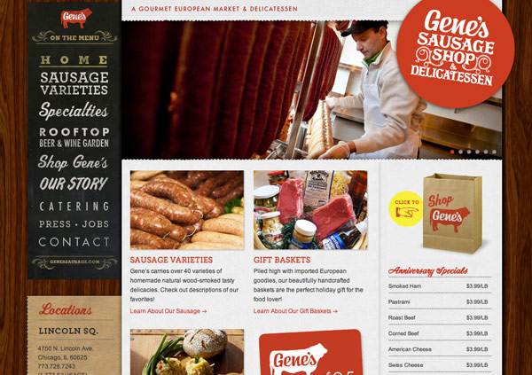
Above: Gene’s Homepage. Beautiful use of typography & textures to bring out a vintage, old-time feel.
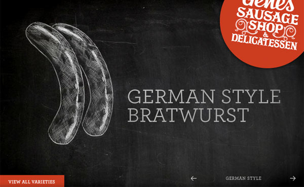
Above: Chalkboard style slider. The transition between each sketch resembles a chalkboard eraser in action. Click image to preview.
Why it Stands Out
Their use of red is very smart, considering it’s their main color. They use it for important elements only. Buttons, links & page titles. It’s very clear what is clickable and what is not. The size of the body text is perfect for reading. Usually the ideal size is a bit larger than most designers are using. The size of the text in the right-hand sidebar is slightly smaller so the focus is given mainly to the content in the middle column of the page.
The different textures all work very well together. It’s difficult to use multiple textures as it can be a bit distracting if not done properly. The wood grain, paper edges along the top, the brown packing paper for the locations on the left and the chalkboard effect are all elements found in the physical store.
Many different fonts are used throughout the site, but they all work together well to produce a vintage, old fashioned feel. Another small element I find quite brilliant & simple is the plus arrows found on images that are clickable. How else would someone know if an image can be enlarged if you don’t give them some indication that does’t require a mouse over?
Top App of the Week
O Magazine App
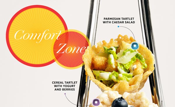
One of my favorite experiences on the iPad after Flipboard is reading interactive magazines. With a price tag that’s the same as its printed counterpart, exploring O Magazine digitally is a much more immersive experience. You can actually click on the products you want to buy. Snowmen dance on the page and videos add another level of content to the magazine that you don’t get with the printed version.
Above: Throughout the magazine there are interactive elements you can tap, scroll & slide to uncover more content.
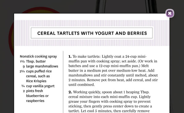
Above: After tapping on a plus button from the previous image, the recipe for that food is exposed
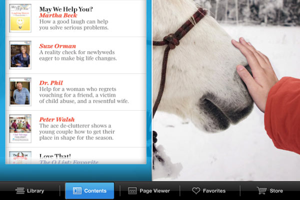
Above: A more visual table of contents (compared to the printed magazine) appears when clicking on contents in the bottom navigation bar.
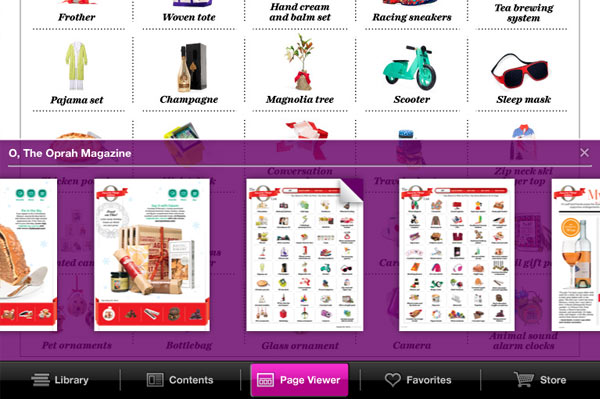
Above: Finding a page has never been easier. No longer do we have to flip through pages of advertisements or have pages stick together by treaded static.
Above: Oprah’s Favorite Things List can be sorted and shopped by price or individually. The wonders of the iPad are being used to their readers advantage!
Why it Stands Out
A lot has been gained by moving O Magazine to a digital platform. They’ve cleverly integrated interactive elements throughout the magazine to provide a fun & more efficient experience to their readers. The design of these new elements are clearly marked with instructions making even the most old fashioned O Mag readers savy iPad users.
Sharing recipes, articles & products has never been easier. Instead of having to re-write, copy or borrow your O Magazine, you can simply email or take a screenshot of something you want to share. The color coding of the buttons used to share or mark as a favorite stand out great, even with colorful surroundings on some of the pages.
Overall O Mag has always been top notch when it comes to art & design. They continue to do so in a sea of apps. I suggest you grab a copy of the latest O Magazine for the iPad and check it out for yourself! There are some great gift ideas if you’re finishing up your holiday shopping.
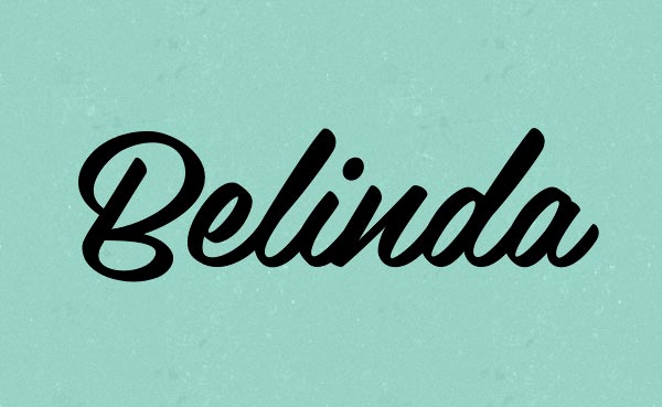
Belinda Script Font
This web & print typeface is lovely! It’s readable at small sizes and the connections between each letter are flawless. Belinda is feminine, retro & somewhat casual. It could be used in a formal setting if utilized properly. It’s a font that could go either way.


