Your Homepage. Your Service page. Your About page.
These three pages are often the most visited pages on your entire website. It might not be in this order, but there is no doubt in my mind that these three pages are either your top three pages or in the top five.
Much emphasis is put on the Homepage and the Service page, but poor About page often gets overlooked. I would argue that the About page is the most important page on any website.
Do you think that’s crazy?
Maybe it’s a little surprising since most people don’t spend much time on the About page. There are some people that don’t even worry about putting an About page on their site. It’s crazy.
People connect with people.
That’s a phrase I think about all the time when I’m writing. We might think that people connect with our brand, but in reality people connect with other people. We purchase things from people we trust. There is more to making a purchase than getting a good value from the product. We want to feel a connection to the people that provide the product or service or we want to feel connected to the other customers.
Either way, people connect with people.
This is why the About page is so important. People are visiting your About page because they want to form a connection with you and thus, your brand.
Here are 5 characteristics of amazing About pages. Use these as inspirations for your next design project.
1. Proof of Actual People
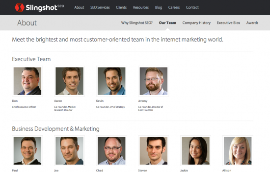
This is actually a deeper level of the About page on Slingshot SEO. What I really like about this page is that there is a human element to the team. From looking through the entire website including the About page you’ll find that there are actual people working for Slingshot SEO. It’s not just a faceless brand. When you work with this company you’re working with actual people and you can see them right on the website.
People are visual. When you can put a face to the name you read in email correspondence and to the voice you hear on the Skype call it makes a big difference. It’s easier to build trust and to understand each other when you have a visual.
2. Social Proof
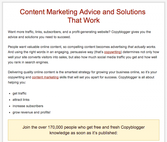
Copyblogger has a great About page. First, the page includes photos like we mentioned above. There are people that work at this company and you can feel like you know them by reading their story and seeing their photo.
But beyond that fact Copyblogger does something pretty interesting. They use social proof to justify their place in the market. Right there in the tan background you’ll see that 170,000 people trust this brand. That’s pretty impressive to the new person. It’s almost like you could stumble on this page and realize that 170,000 people trust this brand with their time and maybe even money.
That social proof goes a long way when it comes time to make a purchasing decision.
Social proof works in this way, but it can also work with testimonials and other reviews your clients have provided.
3. A Story
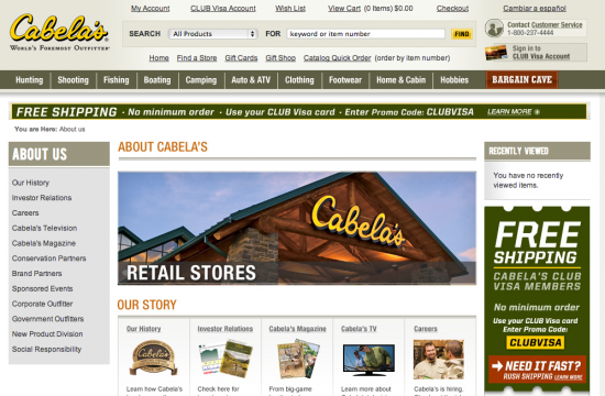
Cabela’s is one of the biggest retailers and ecommerce companies in the world. And they have a great About page.
The Cabela’s About page is visual. There are images of the stores along with images on all the sub-About pages. The visuals and photos help tell the story of Cabela’s. And that’s where the inspiration is for this characteristic.
Cabela’s does a great job of sharing its story with customers. People like stories. It could be the story about your company or the story about your product or service. Everybody likes to read, hear about or see a story. It’s part of human nature to connect with stories and if you can tell a good story on your About page you’ll win over customers. It seems strange, but you can actually increase your conversion by telling a good story.
Cabela’s tells the history of their company. They also talk about how the story is playing out today and tomorrow. All of this is part of the story of Cabela’s and their customers want to be a part of that story.
4. A Stance
What does your company stand for?
It’s a simple question, but one that isn’t always easy to answer. In fact, some people in companies will give you a blank stare if you ask them.
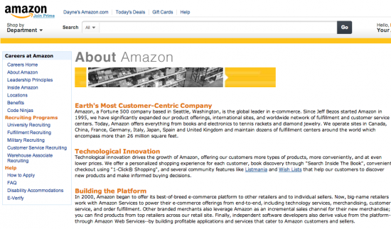
Your company likely stands for something. On the Amazon About page you can clearly see in the first heading what the company is all about. They are customer-centric. That’s what drives their decisions. This page is for the customers and the prospective partners and employees. All those people view this page and once they get there they immediately understand what the organization is all about.
5. Video
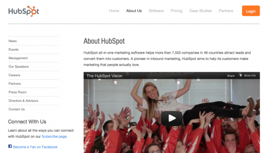
Something that will likely be important in the future is video. On the HubSpot About page you can see that the company is using video already. Telling stories and showing the people that work in your company will probably include some kind of video in the future.
These are just five of the characteristics of amazing About pages. As you look to create your amazing About page use these as simple guidelines. You should have the goal to be amazing, but also think about what you can do to be even better than these examples. These companies started out with simple ideas and inspiration, but they all strive to be different and that includes being different with their About pages.
