Travel Blogging is a unique craft. Travel bloggers are certainly a different breed. They have unique takes on the things they see as they travel around the world. Yet even as you look through travel blogs you notice the slight differences along with the slight consistencies.
Today we’re going to review those consistencies so that when you create your own travel blog that brings you attention along with sales for your business.
We’ll look mostly at design, but we’ll also throw in a few points about style and content.
Let’s get started!
1. Plenty of Room for Photos

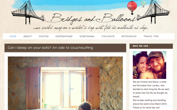
Travel Blog: Bridges and Balloons
Travel blogs are all about telling a story. People want to hear the story of traveling to a mysterious place far away. The romanticism is what draws people in and gets them excited about your travels. They want to hear more and they want to go on their own adventures.
But a big part of telling a story is having visuals. The web allows us to easily add photos to our blogs, but travel blogs have a little added burden. The images have to be wonderful and they have to be displayed in a way that shows them off effectively.
Keep your blog around 600px wide. Make the images as wide as the page. Include captions because people really do read those captions. Sometimes they’re more important than the content in the post.
2. Make It Personal

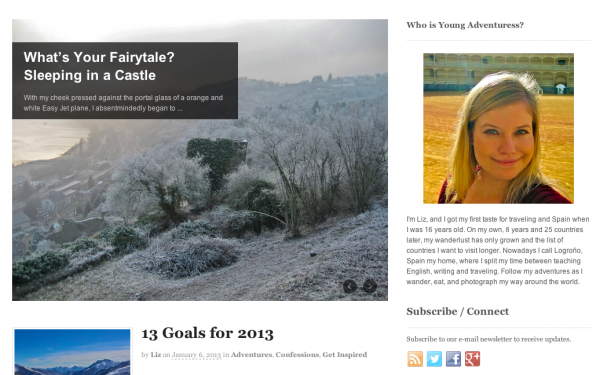
Travel Blog: Young Adventures
Travel blogs are very personal. Stories are a big part of travel blogging and in order for people to connect to the story on your travel blog you’ll need to be personal. Inject yourself into the posts. Worry less about being grammatically correct and just write stream of thought.
Include your personality in the design. Use your favorite colors and textures. Sit down with your designer and let them ask you questions about your personality. They’ll be able to pick up on the things that make you “you”. Let them do their job and make this site personal to those that are writing for it.
3. Links Should Stand Out

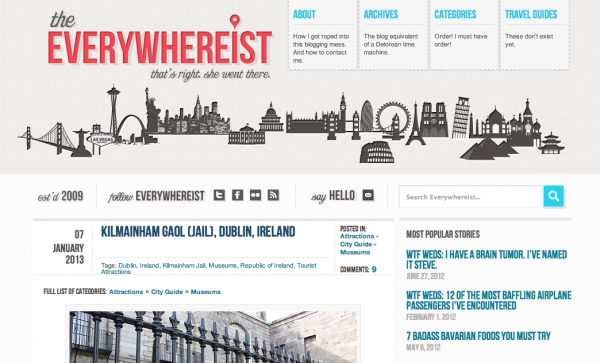
Travel Blog: The Everywhereist
LInks are a big part of travel blogging. People are always looking to click on the links in your posts. They want to see the websites of the places you have visited including hotels, attractions and even the tour guides. Be sure to include all those links as courtesy to the places you went and make sure those links stand out.
Links can get lost on the page, but they are important. Make the link a call to action color and keep that call to action color consistent throughout the site. You want people to be trained to click when they see the color.
4. Texture Is King

Travel Blog: Trekity
There are quite a few travel blogs out there that have a certain texture. You can look at a few of the images on this page and realize that backgrounds have texture. It just seems to add a unique element to the different sites.
This is a current trend in travel blog design. If it fits your style then add some texture to your site. I think it’s a trend that could stick around for a while.
5. Series Work For Repeat Traffic

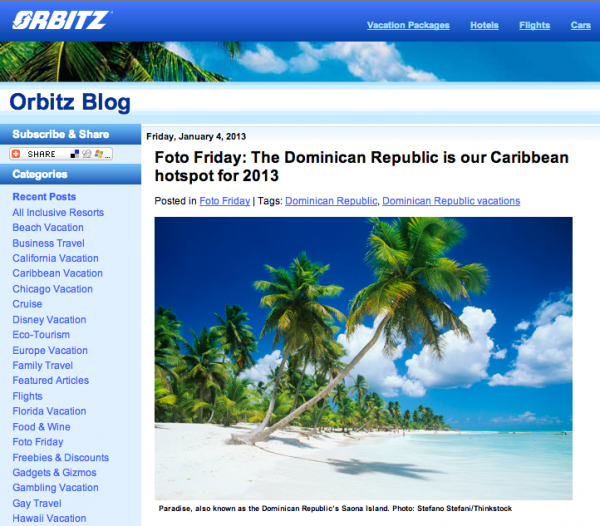
Travel Blog: Orbitz Blog
Lots of these travel blogs have series posts. You’ll see things like WTF Wednesday on Everywhereist or Foto Friday on Orbitz. These type of posts get people coming back each week to check out your blog.
There are lots of new visitors to blogs. The trick is getting them to come back. Series are great for this. Also make sure your email newsletter call to action stands out. You want to get as many people on that list as possible. It’s where you’ll make your cash.
Conclusion
There are lots of things similar about the various travel blogs out there. You’ll notice differences, but there are some elements you’ll want to have consistent on your new travel blog.
Work with your designer to create something that speaks to your personality and make sure the calls to action stand out so people do what you want.
Did we miss any of your favorites?
Leave a comment and add the link to the post.


