When it comes time to design or redesign your website it’s good to have inspiration.
You probably look at websites all the time.
Maybe you notice it and maybe you don’t, but most of us have favorite website attributes.
I like to think that many of us prefer many of the same attributes. We’re all human. We like things that are simple and that make sense. It’s hard for us to create things that are simple, but we appreciate simplicity when we see it.
Let’s get into the attributes that make for a great business website today.
1. Clear Headings
What does your business do?
It’s a simple question, but visit many business websites out there and you’ll have no idea what the business actually does.
As a website visitor it’s frustrating. I don’t want to look around for this basic information.
Clear headings on every page of your website should say within a few words what is provided for the visitor.
When I visit your homepage I want to know what you do, how I can learn more and where I should go next.
Clear headings make that easier to understand.
2. Photos Of Real People
To me, models in stock photos aren’t real people.
I think stock photos are a great option if you can’t afford to take your own photos or if you don’t want to, but those are pretty lame excuses these days. It isn’t that difficult anymore to have high quality photos of the actual people in your business.
More companies are doing this today and it’s because that’s what people want to see. We don’t want faceless brands. We want to see the people we’re dealing with.
And it’s okay if those people change. It’s easy to change the photos. Just let people see the people they’re going to be working with.
Add a human element to your site.
3. Illustrations
I don’t know when this became popular. I’m probably late to notice, but illustrations are appearing more often it seems.
And I like it.
Reading content is great, but sometimes I need something visual to show me what your company does.
Video is great. Photos are great.
But illustrations give your designer a blank canvas to express what you do and how you do it to website visitors.
And illustrations are completely customizable to fit your brand’s personality.
4. Responsive Design
One of my favorite things about a website is responsive design.
Every day it seems like I visit more and more websites on my phone. I know I don’t represent all people, but I think many of us out there use the browser on our phone to look at websites.
There is nothing more frustrating to me than a website that isn’t optimized for the mobile browsing experience. I hate when text is too small. I hate when I try to scroll up and down on the page only to have the content shift from side to side.
Responsive design makes it easy for a website to provide a good experience no matter what device a visitor is using.
5. Proof
I think I’m pretty trustworthy.
If you tell me something I’ll probably believe you especially if I haven’t met you before. I don’t think it’s healthy to go through life questioning every new person you meet.
That being said, it makes me feel better when you have proof.
For business websites, proof comes in the form of case studies and examples of the people that are your clients.
Showing logos on your website gives visitors and prospective clients a good feeling that others have been willing to hire you.
That comfort makes it easier to say “yes” when the time comes.
6. Freshness
Finally, when was the last time you updated something on your site?
Now, when was the last time you updated on your site that has a date?
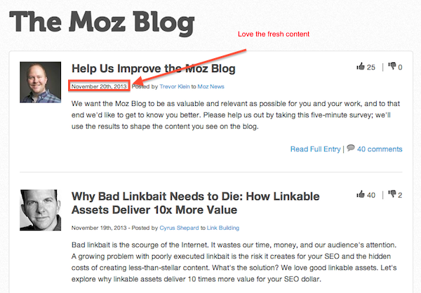
Some say that putting dates on your business website is not good. That might be true in some ways, but I think it’s important to let visitors – new and repeat – that you’re putting effort into your website.
A blog is a great way to keep your site fresh. It lets visitors know that you care about your site and that you’re active.
Having a fresh site doesn’t necessarily mean that you provide good service, but some people think that way. If your site has gone unchanged in three years a new visitor might think that you’ll neglect their needs after a short time.
I’m biased when it comes to blogs, but a blog is a great way to keep your site fresh.
Conclusion
These are some of my favorite website attributes.
Hopefully it’s provided some direction for your new website project.
Do you like some of the same things?
What do you like about websites that is different?
Share your thoughts in the comments.


