Autumn marks the end of summer, which is likely the biggest tourism season of the year in the US.
But the fall season still has much to offer those looking to getaway. Even if you aren’t looking to travel far to see some interesting sights there is likely something you can find right in your own backyard.
With the spirit of traveling during the Autumn season I thought we could analyze a few of the trends in travel website design. We’ll look at the elements currently popular on the websites.
If you’re the owner or manager of a travel website or tourism website this overview should help inspire some design agendas.
Current Trends in Travel Website Design
Many travel sites look the same and that’s no surprise. When sites start to stumble on a formula that works it’s common for others to quickly follow suit and make their own site in similar fashion with a few unique twists.
Some of the trends happening with travel sites right now include:
- Large Background photography
- News Content
- Featured Destinations with Stories
- Social Media Effort
- Deals
There is more to each of the travel sites featured below, but these were the elements that caught my attention. Let’s review each in more detail.
Background Photography
Perhaps the biggest trend in travel website design is using large background photographs. You’ll notice on this example of Travel Wisconsin.
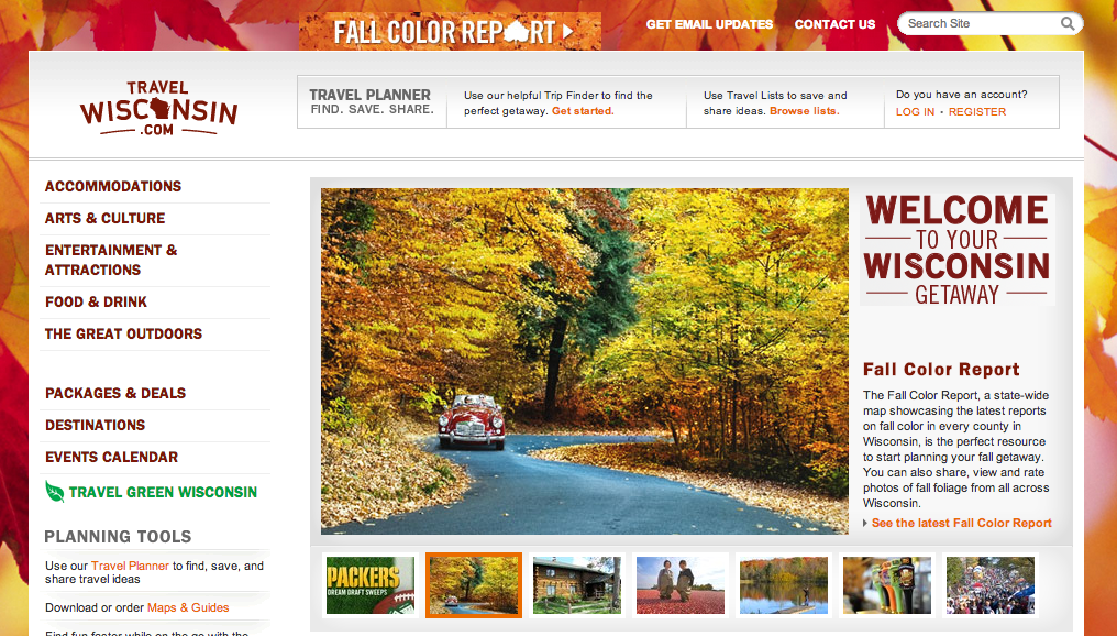
The background of the Travel Wisconsin website changes with the seasons. Today, the background features beautiful autumn colors.
As someone that loves this time of year seeing this background puts me in the mood for traveling to see the leaves on the trees. You can even see that this emotion is taken even further by the featured image in the middle of the page. There is a car traveling along a country backroad where the leaves are falling and the trees looking amazing.
Backgrounds can get pretty boring and I’ll admit that my usual taste is for plain white, but for a travel site I can really see the advantages of using background photography. When done right you can see the background photos creating emotion in the visitor and that’s really one of the main goals of these travel sites.
Emotion leads to action and the action for these sites is to get people to go on little trips and visit the sponsors on the page.
When I visited the Travel Wisconsin website I was overcome with autumn emotion. It brought back memories and made me want to travel. I looked further into the site at some of the suggested destinations.
The design element worked perfectly.
Featured Destinations with Stories
Next up we look at Vermont Vacation.
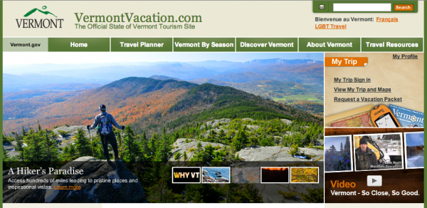
The first thing you’ll probably notice is that the Vermont Vacation site doesn’t use a background photo. They still do a great job featuring great original photography on the featured section on the homepage and on other areas of the site.
Anyway, what I like about this site and other travel sites is how they are using stories as the feature for their destinations.
Check out the feature on Downtown Montpelier. The content describes the area, but what really gets you interested is the story. The details and the story of the area make you interested in seeing a place like this. You can always describe something, but people connect to stories.
What would be really interesting is if the Vermont site would talk to people visiting the state and tell those stories. Each year or maybe even every month the site could feature a traveler to the state and tell the story of their trip.
People connect to other people and their stories. Reading or even seeing a video of someone visiting the state makes others want to go on the same adventure.
News Content and Blog
Discover Ohio comes in next with their own innovative travel blog.
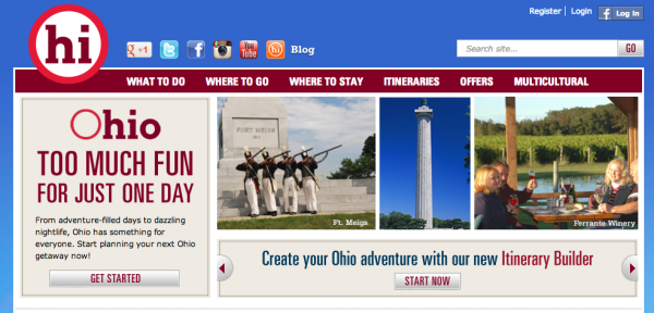
The site is really cool. You can see the bright blue background. The design is different and kind of funky. I’ve never been to Ohio so I’m not really sure if the state has people that are a little quirky and funky, but maybe this represents them well. It’s an interesting site that gets my attention.
Anyway, the blog is great. There are stories being told and the blog is updated regularly.
Most blogs in all industries are usually updated a few times the first month and maybe once the next month and by the third month things are pretty much left alone. The owners of the sites get too frustrated because there isn’t much traffic coming to the blog right away. It’s hard to see this happen, but it happens all the time.
That’s why it’s great to see the Discovering Ohio blog. I think the site and its managers are doing a great job using stories and photos to create something emotional for visitors to read and react to. This kind of content gets people interested in the state.
Keep your travel blog updated with stories and featured news items affecting the state. People want to read this. The content gets them to take action while also keeping your site fresh and new.
Lots of Focus on Social Media
It’s not really surprising to see social media featured on all of these sites, but for some reason I was a little caught off guard. Let’s check out the Visit New Hampshire site.
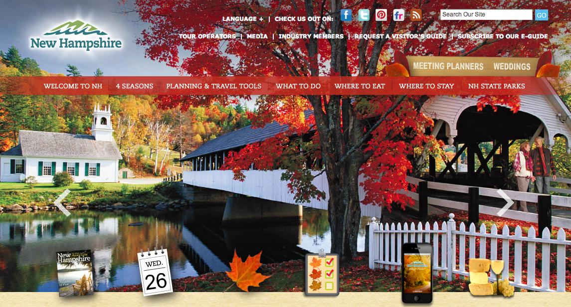
First off I have to mention this background. It’s amazing. You notice right away what’s going on in New Hampshire right now. The leaves are changing colors and you just want to be there in this picture. This site actually takes things a step further and really makes the background the focus of the homepage.
Once I was able to stop examining the amazing photo I noticed the social icons at the top of the page. This is pretty common among all these sites and on other travel sites. Social Media is big and lots of travel companies are using social media to find their target customer. Sites like Pinterest and Flickr make complete sense. You can share photos of the state and get people interested in visiting. Instragram is another social app that people love using for photo sharing.
My recommendation would be to focus on social media as a way to build an audience around your travel website. Share content on the social media sites, but share more content on your own site. Create your own photo galleries where people can view amazing photos.
The strategy for social media is to find people and get them to discovery your brand. From there you want them to take action, which is visiting your website or simply getting them to visit your state.
Deals
Finally we look at Travel Oregon.
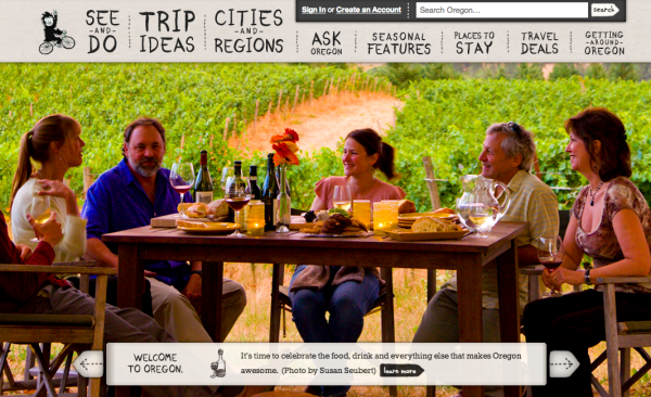
Again, great use of a background photo. I personally didn’t realize that Oregon was this big into wine, but obviously it’s a goal of the site and perhaps its wine company sponsors to get the word out to people. Oregon is a state I’d like to visit and that’s a reason for it being featured in this post. Knowing that they have great wineries makes the state even more appealing and interesting to me, a potential traveling visitor.
But what we’re focusing on for this site is the Travel Deals tab at the top right of the navigation.
Deals are big time. In the last four years there has been a pretty large portion of the consumer public that is trained to look for deals. These folks want to feel like they are getting value for their purchase. They want to know that they are getting a percentage off the regular price. In their mind this means they are getting something worthwhile and they won’t even consider taking action unless their is some kind of deal involved.
I’m not saying you need to offer deals or discounts on your travel site. There is just a portion of the public out there that now loves its deals and they won’t respond unless there is some kind of deal involved.
Be careful with deals. Once you get people trained on them it’s really difficult to go back to regular pricing.
Also remember that your state is selling something. Focus on the great aspects of what you’re selling like the experiences and the enjoyment and the relaxation. Those are what sell and they’ll sell at a fair price. If you focus on expressing value in that way you can sell something at full price and people will love to pay it because they realize they are getting their monies worth.
Deals are good for some segments of the population, but not every segment.


