Design brief
A document with multiple questions about your business.
Example of design brief questions:
- Who makes up your target market?
- List your main competitors.
- What are your goals for this project?
HTML
Stands for: HyperText Markup Language
Consists of different tags combined to create the structure of any website. The tags are put together in pairs with the content of your website filling in the spaces in between.
CSS (Style Sheet)
Stands for: Cascading Style Sheets
These documents contain the colors, fonts, layout and overall appearance of a website. They are separated from the HTML structure to reduce repeating the styling of similar elements on multiple pages. A style sheet may only need to be altered once to have an affect on multiple pages of a website, hence having a cascading effect. A style sheet can control the layout of a website. Some web designers choose to separate the colors and fonts in a separate style sheet than the layout elements. There are also different style sheets that apply to printing a web page or to view a webpage on a mobile device.
PHP
Stands for: HyperText Preprocessor
It allows for dynamic web content to be displayed and/or interacted with on a web page.
CMS
Stands for: Content Management System
A CMS allows it’s users to edit, delete and manage the content of a website from a visual interface. A successful CMS requires no knowledge of programming languages, CSS or HTML to easily update a website. A CMS can be open source or built from scratch depending on the budget of your web project and the needs of your organization.
Open Source Examples: Expression Engine, WordPress, Magento, Drupal, Contao.
SEO
Stands for: Search Engine Optimization
Planning out and writing a website’s content to improve the likelihood of it showing up for relevant search terms in search engines such as: Google, Yahoo & Bing. SEO can be a part of the following tasks: Keyword research, content writing, web design, web development & blogging.
Alt attribute
Alternate text used to describe an image. Used by search engines and screen readers in place of an image.
Example of HTML: <img src=”example.jpg” alt=”example image”>
Title attribute
Text used to describe the webpage in the top of the browser window. A HTML page title is recognizable by search engines and should be carefully detirmined. It is displayed in search results for the title of a page listing.
Example of HTML: <title>This is your page title</title>
Call to action
A button, arrow or other graphic element, which entices a user to perform a particular action.

Example of Usage: A button appears to be clickable, causing the user to click on the button and bring them further into the website.
Hero
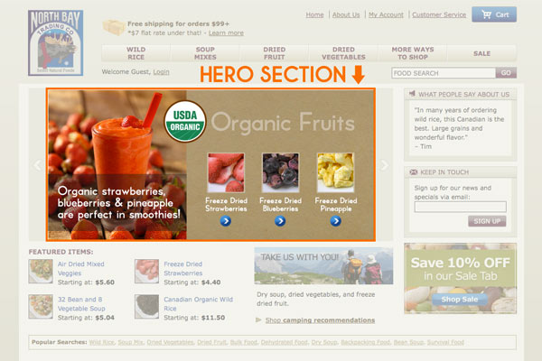
A common term used to refer to the main image on a homepage or landing page. Below you’ll see an example of the hero area highlighted in orange.

Promo area
An area on a website which can be used to promote products and/or services and is typically changed out frequently. A promo area is typically used to showcase graphics.
Exit page
When looking at web analytics (data statistics from your website) an exit page is the last page a visitor may see before exiting your website.
Example: On many e-commerce websites, the shopping cart is a popular exit page.
Landing page
A page on a website that contains specific and direct promotional content or information that a user is directed to from clicking an advertisement or other external link.
Drop-down
A drop-down can be one of two elements: A drop-down menu is a navigational menu that has sub-menus or categories below it. When clicked on, the sub menus “drop down” and are then visible to the user. A drop-down field is found within a form on a website. It acts similar to a drop-down menu, but it requires the user to choose an option from multiple choices.
Flyout navigation
A flyout navigation menu contains multiple links to different pages and/or categories on a website. It’s typically contains multiple columns, whereas a drop-down menu may only display one column below the main tab.
Rollover
A rollover is an action that happens when a user places his or her mouse over a particular element that has a rollover effect applied to it. The mouse action causes the element’s appearance to change into a different image, color or font style.
Input field
An input field is a blank area where a user would input specific text based information. They are found within a form on a website.
Optimization
This term is used to refer to the reduction of size of an element to be more ideal for web use.
Example: Images used on a website should be optimized to a smaller file size to decrease the time it takes to load the page they reside on.
White space
This term is commonly mistaken for actual “white” colored space. White space could be red, green or any color. It refers to the space around elements. White space allows the elements to stand out to the user. If your designer says your website needs more white space, that means there are too many elements crammed in too small of a space. Having too much white space can also cause elements to be pushed too far down the page. There should be just the right balance of space and elements to form a successful web page design.
Style guide
A style guide is a document that includes all of the colors, fonts, and branding guidelines for a website, brochure, book or complete brand.
A style guide is often a great guide to supply a web developer so there are no questions about the technical specifications of a design. It also can save them time from having to go back and forth with the designer.
Comp/mock-up
Refers to a representative sample or preview of the design for a website, book, brochure, etc.
Example: For a website, a comp would be the non-functioning design sample of the homepage. Or, it could be a design sample the developer would use to setup the link colors on a particular section of the website.
A designer would supply you with design comps to show you what the website would look like before a developer begins to code it. Giving feedback on design comps, rather than coded sample pages will save you time and money, especially when there are changes that need to be made. They act as visual plans.
UI
Stands for: User Interface. A UI designer focuses on the usability between a website and it’s users. They make sure the targeted user can use the website with ease by designing elements to make their experience easy.
Example: The UI of the website allowed the user to easily find the product they were searching for and make a purchase.
UX
Stands for: User Experience. This term encompasses UI. It includes all of the emotions, feelings, moods etc. associated with the use of a website’s UI.
Example: While using Sarah Lynn Design’s UI to find work samples, the user experienced happiness, a sense of clarity and no feelings of frustration while completing the task. The UX of user “A” was relatively good. If they felt confused, frustrated and lost, their user experience would be poor.
Wireframe
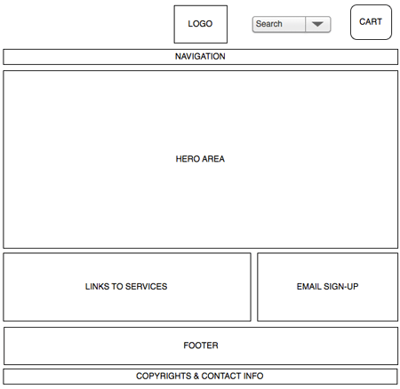
Very crude and simplistic drawings and/or layouts of a webpage, which typically have no design applied. Wireframes are used in the preliminary stages of a website design. They allow for designers to focus on the UI and the layout of content first before applying any design. This is a critical step in any mid to large size website that has a lot of different elements and/or content.
The design of a website can often distract from it’s true purpose of displaying information and content effectively. Many designers do this step first to avoid missing any crucial elements or information. Wireframing can save time in development by allowing for items to be missed in the planning or design phase rather than in the final stages. It typically costs more to rework an already designed and developed web page than to catch a mistake in the planning stages.
Below is a very basic example of a wireframe using a software program called Omnigraffle.

Wireframing Programs: Omnigraffle, Axure, and Pidoco.
Branding
A brand encompasses all messages, promotions, actions, products etc. that a particular business releases to the public. A common misconception is that a logo design is a business’ brand.
To retain consistent branding for your business, it’s important to keep the same level of design across all of your promotional pieces that are visible to the public.
Common file types
.psd
Adobe Photoshop file format – Often used for photography editing, website designs and various other graphics
.eps
Stands for: Encapsulated PostScript
A common vector file format allowing a graphic to be resized without altering the quality or resolution. Designers often request this type of file when needing a business’ logo if used on multiple mediums or large formats.
.ai
A vector file format used for Adobe Illustrator. A vector file can be resized to an infinite size without any data loss. This is ideal for large graphics and certain types of printing such as screen printing.
.jpg
This file extension is used for JPEG files. A JPEG is created with lossy compression. Lossy compression removes portions of the data of a particular file allowing it to be easily viewable on the web in a smaller file size. Photographs are generally good candidates for this type of compression.
.gif
Stands for: Graphics Interchange Format. A simple graphic, typically not a photograph is a good candidate for this type of compressed file. A GIF is created using lossless compression, which reduces the size of the file without removing any of the original data. GIF also supports animation. You might hear the term animated GIF occasionally. Some designers may use an animated GIF in email design or in simple web banner ads.
.png
Stands for: Portable Network Graphics. This file type uses lossless compression and is similar to a GIF. The difference is a PNG allows for transparency and can’t be used in a CMYK (print) color space. It’s meant for use on the web. PNG does not support animation.
.swf
Stands for: Small Web Format. File format for displaying animations on the web. A SWF is created by the program Adobe Flash and can’t be edited. To edit a flash file, you need the original .fla extension file.
Continue Reading Chapter 5: Design Principles 101


