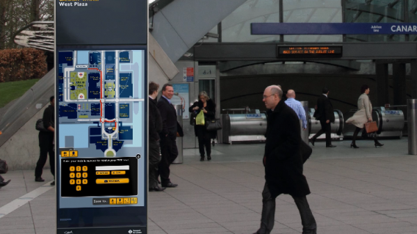
Above: Digital wayfinding kiosk from Scala
Think back to the last time you were at the mall or at a big event.
Chances are you passed by a digital wayfinding kiosk.
You may not have used it, but more and more people are using these helpful navigators to help them find out where they should go and how to get there.
These kiosks are part of the movement toward all kinds of new screen technology. Companies and organizations are using kiosks to provide a better experience to visitors, but also to increase sales by making the experience more organized and optimized for sales.
Are Digital Wayfinding Kiosks For You?
If you own a destination that involves navigation, a kiosk will likely help improve your customer experience. Places that use these kiosks include:
- Zoos
- Shopping Centers
- Fairs
- Conferences
- Music And Art Events
- Museums
- Aquariums
- Water Parks
- And More!
Let’s use the conference center example.
When a visitor arrives at a conference they usually have questions about where they need to go. Traditionally, the person would look at their binder full of information or a static digital screen with multiple rotating slides. If they can find the right page they will look at the map to see where the right room is for the first event on their list. Or they have to wait around for the next screen to change. In a large conference center they might have to wait some time to find their particular event’s information.
That experience might also include looking at a large printed map, which is helpful, but also difficult to update if the building changes and events are rotated in and out.
With a digital kiosk, visitors can easily find the information they need. They can touch the screen and find exactly where they need to go and in some cases they can even find more useful information like where the restrooms are located and how they can find nearby food and drinks.
The kiosks often take up less space than printed materials and are easier to update when things change.
Digital Wayfinding Best Practices
If you’re new to digital kiosks there are a few things to consider when it comes to making your kiosk a great experience for your customers.
Instant Recognition: Digital kiosk design is similar to print, website and app design. When someone starts using the homepage and every page they land on you want them to instantly recognize what they’re looking at. You can do this with clear, simple headlines and images that reflect the content the person is looking for. Don’t try and reinvent the wheel when it comes to symbols and iconography. Use standard icons for restrooms, food and dining and other common locations throughout your venue. When your users are on the go or in a hurry to find something, speed is key and recognizable imagery will serve them well.
Limit Calls To Action: A tendency with digital design is to include every possible action item on a page that a visitor might want to take. Focus on the things your visitor most often wants or the thing you want the visitor to do. Imagine a visitor walking into a candy store that has 500 different candy options. To present all those options the same at that level would be overwhelming. Instead, great segments, categories or featured items to help the visitor get to their desired destination.
Appropriate Font and Font Size: I was checking into a hotel not too long ago and noticed a digital sign behind the check-in desk. It was showing interesting information, but too often the font was too small to read. On kiosks, you have to make the font appropriate for those using the kiosk when they’re right in front of it, but some screens also need to have larger font to attract the attention of people that are a few feet or more away.
Have you worked with digital kiosks?
I’d love to hear your thoughts and experiences in the comments.


