Last week I had the privilege of attending An Event Apart in Seattle. I learned so many great techniques and information in just three short days. I also had an incredible time exploring Puget Sound & the downtown.
As a designer it’s my job to make sure you are receiving the most accurate, up-to-date information when it comes to anything web related. An Event Apart invites web professionals in many different areas to speak on a variety of topics. These folks are the best of the best and are forward thinkers. It was an honor to listen to them speak and I hope to share what I’ve learned with you over the next few articles.
> If you want to get a snapshot of all of the articles, we’ll be featuring some of the speaker summaries in our next monthly newsletter. Sign-up today!
Enjoy!
During Josh Clark’s presentation on Designing for Touch I learned a few guidelines to help you better prepare your website or app for touch.
Placement of Controls & Navigation
Over 75% of interactions on mobile devices are accomplished with one thumb.
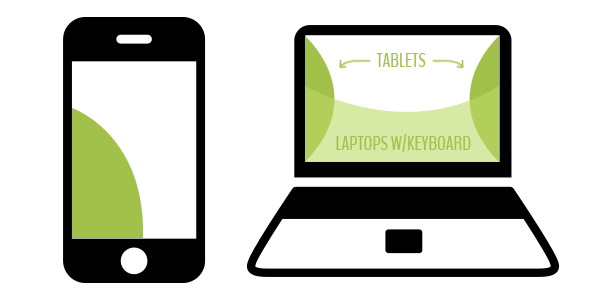
The way people interact with their devices should be taken into account when planning out a design. Many smartphones are held with one or two hands but generally are navigated with one thumb or index finger. Some of the hybrid laptop devices that cater to touch are held like a tablet or they are often navigated with one index finger (much like a smartphone).

Touch patterns for mobile devices (above)
Knowing these key usability patterns, why do we consistenly place our navigation at the very top? This old way of thinking about mobile is not relevant. I’ve learned that the desktop mentality I have been comfortable with for some time doesn’t apply to all devices or whatsoever to cater to touch.
The bottom left is a great place for key content that requires user interaction on a smartphone. For tablets, try placing the navigation off to the left or right, almost like you might see social share icons placed on some websites out there. These are great guidelines, but of course they may differ depending on your website’s content. Always cater your website’s design to your content first, keeping these touch patterns in the back of your mind.
Detecting Touch Devices
Design your responsive website to be touch friendly 100% of the time.
Don’t even bother trying to cater your website to touch devices based on screen size as that is irrelevant now. All desktop designs should be touch friendly too. Microsoft has already proved this to be true with their new tablet/laptop hybrid devices which are touch friendly. There is a device of nearly every size from 2.5 inches to 70 inches that can browse your website. It’s irresponsible to try and cater to specific device sizes if you have a responsive website (or will in the future).
Using hover effects to hide/show key information is now a very big usability issue when designing for multi-devices & touch. Use hover effects as an enhancement to your design. If someone can’t hover, don’t let it ruin the experience or make navigating the website impossible.
Samsung has built-in hovering capabilities on some of their devices, but this doesn’t mean you should cater to the device. Always think about the people who will be experiencing your website and brand.
Design for the majority and provide a website that offers the best experience across all devices.
Desktop Design Guidelines
Josh spoke a lot about rethinking desktop focused designs. Hybrid touch devices change old conventions for clickable elements. Buttons and links need to be touch friendly and in many cases that means giving key calls to action more space and presence on a page.
44 pixels is a good rule of thumb for the size of a clickable element. This could be vertical or horizontal.
Try to avoid cramming too many clickable elements in one small space.
Clarity trumps density. -Josh Clark
By all means offer complex content to your users. Try to do it a little bit at a time, when requested. Start out simple and offer more information & complexity as the user explores the page.
Mobile Design Guidelines
A common takeaway at the conference was how to handle large amounts of content on a small screen. This has often resulted in content stacks and very long pages. Assumptions have been made that users prefer to scroll and swipe compared to clicking.
We might start walking around with incredibly muscular thumbs if our websites keep getting longer and longer. How can this content stacking be avoided?
Start thinking mobile first.
Off Canvas
One technique Luke Wroblewski inspired is Off Canvas. It allows you to take advantage of the space to the right and left. Give your visitor the most important content first, no matter what the device and show them the extra stuff when requested. This can also be used along with some backend techniques to allow loading of off canvas content to happen when requested. This will help reduce page load initially.
If you’d like to learn more about catering to touch devices, check out Josh Clark’s article New Rule: Every Desktop Design Has to Go Finger-Friendly
Keep a look out for more great articles inspired by An Event Apart Seattle this week.


