Email design is a very important part of any email campaign – if not the most important. Where certain elements are placed, which offers are presented and what imagery is used can all be huge influencing factors in how your email campaign is going to perform. Over the past two months I’ve rounded up a few email designs. Here are a few I’ve found are most successful and why.
Cater to your Customer’s Curiosity
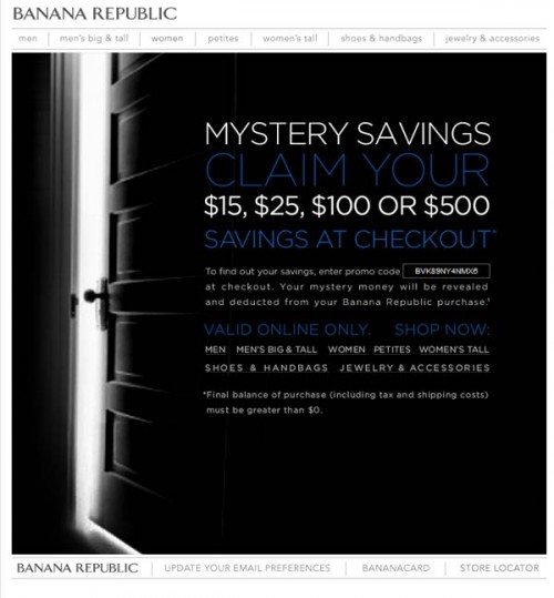
The Banana Republic does an excellent job offering up a mystery amount of savings. This idea is a great way to get customers to click on the email and bring them to the website where they can then be enticed by more products and their awaiting offer. What I found somewhat clever as well was the fact that you didn’t see what the offer was until you found your items, proceeded to the checkout and then entered the promotion code in. In theory this idea is great because it gets the consumer to look at the different items and get as far as entering in their billing information. But, it could be frustrating to the customer who isn’t looking to purchase, but is soley enticed by the awaiting offer. I also thought it was smart to show the customer what they might be saving on their purchase. A chance at 500 dollars at their favorite retail store is a great way to bring the customer to your website.
Clever Concept
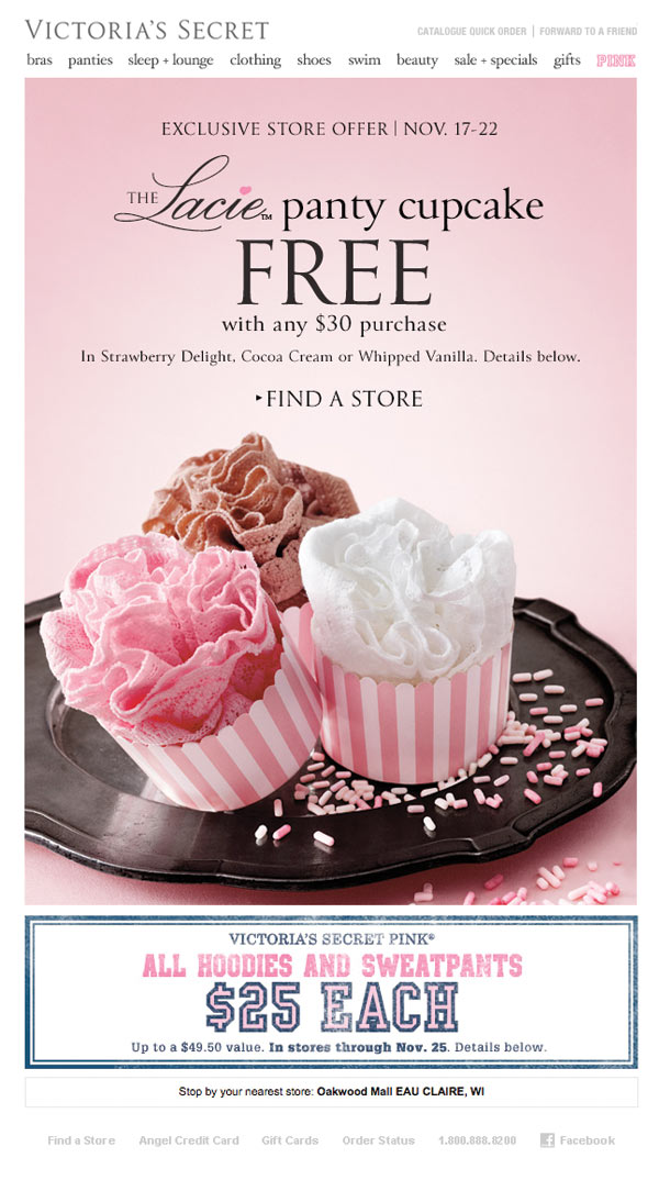
This email made me laugh which in turn got me to send it along to other people. Simply put, a clever concept is going to help your email campaign tremendously. Having a plan before creating an email will show your customers you really do have something special to show them. Give them a reason to sign-up for your emails. Details are very important to any type of design. I especially love how this marketing team took the name of each panty and turned it into a frosting to bring the whole concept together. Great work! This naming technique not only is cute and playful, but it also gives the product more personality. They are no longer just free lacy underwear.
Email Reminders
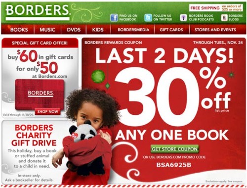
Borders consistently reminds their customers about sale deadlines that are approaching. With the many things happening in your daily life along with the list of emails that need replies, chances are, you probably won’t remember that great deal you saw while sipping your morning coffee. We all need reminders, and this is a great way to put some urgency behind the offer as well.
Content is King
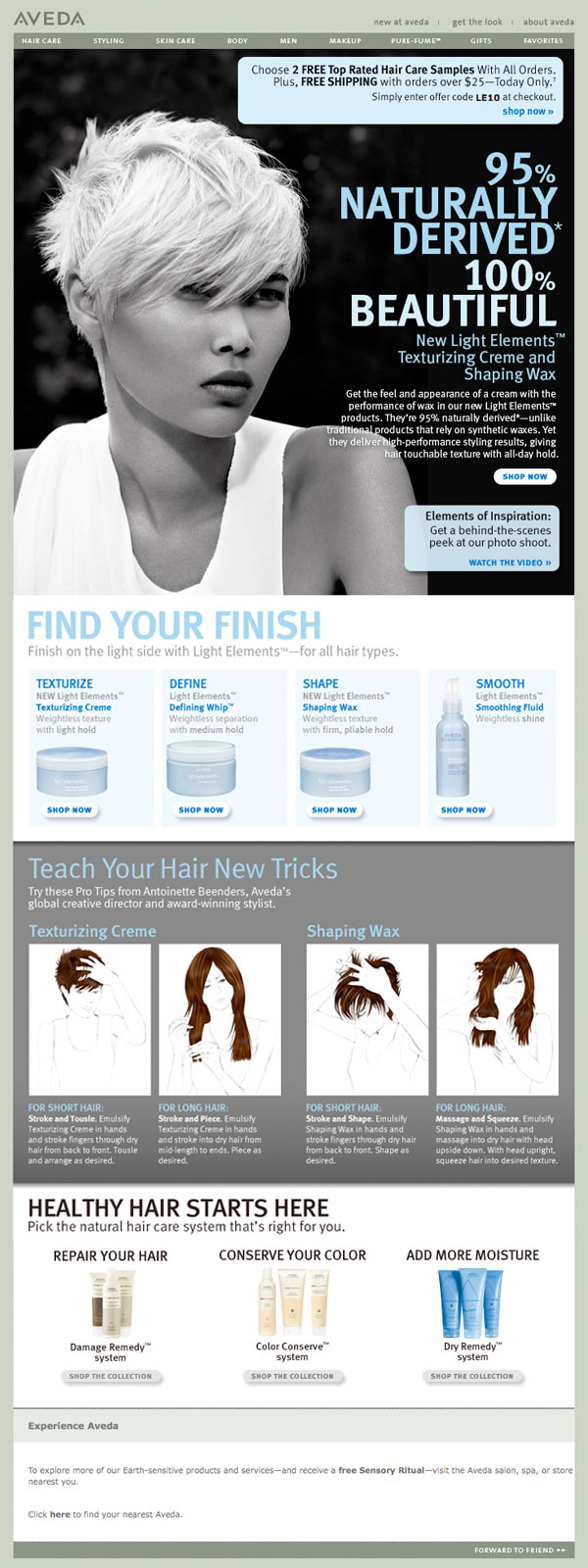
Length isn’t a factor anymore when it comes to email design. Many users are used to scrolling on websites and the same is true for emails. So give your customers something worth reading. Tell them about your products likes Aveda does in the example above. Why should they click through to your website? What can you offer them that can improve their life and make them look forward to hearing from you? Retailers walk a fine-line between spamming and providing valuable information to their customers. Which side of the line are you on? Make sure your putting some thought behind your email campaigns. Customers want to know why your products are better than your competition. Tell them why.
Sale Product Focus
When promoting your sale items, prove to your customer that your sale items do in fact offer value. A good offer drives this example from PetSmart and follows with many different items that might appeal to various pet owners. And even better, they are all on sale. More often than not I see sale emails with the top percentage off and no sale items featured. When you think sale items, what immediately comes to mind? Unwanted items. Products that are overstocked and are not selling as well as you’ve expected them to. The goal is to make these items seem more appealing and to at least showcase products, rather than solely a top percentage off. If your customers don’t see a few of the products offered on sale they won’t feel as much of an urgency to visit your site. Certain customers who don’t have much money to spend are still going to be looking for items on sale. With this in mind, you will see results when simply using a percentage off. But, to reach a larger customer base, using both products and a percentage (like this example) will boost clicks even more.
Sensory Tactics
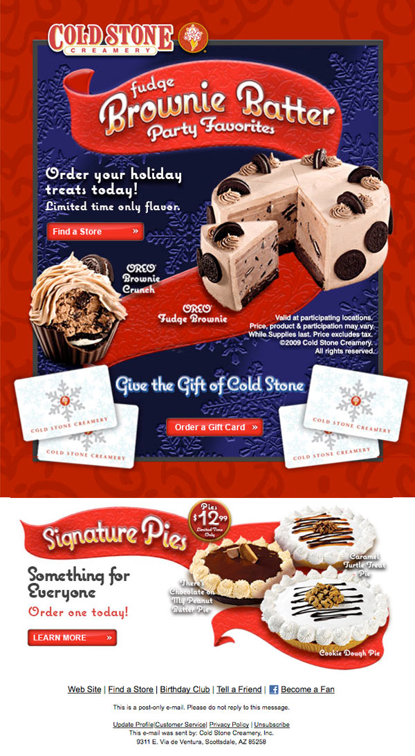
If your business sells food products keep these key elements in mind when emailing your customers. Visuals are key when it comes to food. If it looks good, there’s a good chance it tastes great too! Cold Stone does a great job of highlighting the interior of their fudge brownie ice cream cake which adds to the overall appeal of their product and brand name. Photography is key when appealing to your customer’s senses. You want your product to look it’s best and highlight it’s tastiest features. Descriptions of the product are also important, especially if the key ingredients aren’t visible. This could include organic and natural products or special ingredients only available from your company for example. Cold Stone also does a great job of connecting delicious product with their gift cards for the holidays. Do take advantage of holidays. Customers expect promotions and deals during certain times of the year. Give them what they are looking for otherwise your competition is going step-up and give them discounts when you are not. Pay attention to the competition as much as possible. Sign-up for their emails and see what they are doing.
More Great Email Marketing & Design Resources
20 Email Design Best Practices and Resources for Beginners
Useful Web Design E-Mail Newsletters
