Fore!
Each year, over 20 million people will play golf in the United States. That’s a lot of white golf balls flying around and people chasing after them. The game has become a favorite hobby for some and a downright obsession for others. Golf is a game of patience, frustration and in some cases it can even be a game of reward. The golf industry has been growing since it first began quite some time ago and the industry continues to thrive. Golf courses and country clubs all over the nation are draws for people of all backgrounds and skill level. As we enter the modern age of the Web it’s important for each golf course to have a place where customers can find information about golf destinations.
Elements of Golf Course Website Design
There are a few key elements that go into a successful golf course website design. First, it’s important to remember that golf is an experience. Golfers want to experience a course. They want to feel like they are comfortable yet challenged, peaceful yet excited, and relaxed yet thrilled. The thought of playing a special golf course and envisioning playing well is something special to a golfer. This experience can be created with a great golfing website.
As the owner or manager of a golf course, it’s important to convince golfers to travel to your area and golf at your course. You want them to be excited about playing the course and experiencing all that it has to offer. Here are a few key elements of a successful golf course website design.
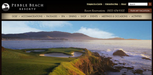
Actual Course Photography
Photography is becoming more important on the Web. It’s especially important for a quality website design. Your customers want to visual the holes from every angle. It’s worth an investment to have professional photographs taken in preparation for your website design. Use these photographs on the site. Highlight the areas of your course that make it unique. You want to give people a reason to try your course over another course. You have to show what makes your course special. Is there a signature hole that people discuss when they come in the clubhouse?
Take pictures of this hole from different angles and really give your website visitors something to excited about. You could even include a few of the testimonials from your current golfers to help sell the idea of playing the course. Photography is something that can sell a great course. Be sure to have plenty of images because they can tell the story better than words in some cases.
Detailed Hole Information
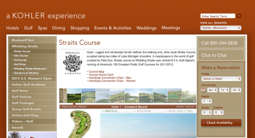
When a potential customer discovers your course online they’ll start doing some research. These folks will consider the price of the course, but after a few quick fact checks they’re going to dive into the hole details. Golfers want to know how they’ll perform on the course. They will examine the shapes of the holes via the pictures or images you have the site. Visitors to the site will read through any details you provide and assess the demands of the holes versus their ability. If a certain hole requires a fade, a golfer that hits a draw will know they have a challenge.
The more detail you can include the better it will be for really getting the site’s visitors interested in the course. Photos are great for visuals, but a detailed explanation of holes can provide even more necessary information allowing the customer to mentally prepare to play your course.
Calls to Action
Finally, a call to action is necessary in most cases. This doesn’t have to be the biggest element of the site. In fact, you don’t want this to be an annoyance. Your visitors are looking for information in most cases and aren’t ready to make a purchase right away. You simply want the call to action to be available when the visitor is ready to make the reservation. Whether you have a phone number or an online tee time registration system, having the call to action visible, but not overbearing is a great way to increase conversions on the site. It’s a quick and easy way for site visitors to act on their urge to play golf at your course.
Other Notes
Price will usually be a question for most of your customers. They want to know all the details about their trip to your course. They want to know if they have to book a room at the resort of if they have the chance to enjoy a lunch at the turn. Be sure to include all of the information your customers typically ask. The website will be the salesperson when there isn’t an actual person available. You want the website to answer all the questions you would typically answer when a new person calls to ask about your course.
Designing a great website for your golf course is a great step to generating more interest in your destination. Be sure to focus on a few key elements and the rest should fall into place. Focus on what your customers are looking for and include it on the site. Show them the experience and you’ll have them through the door.
From there the course will take over and you might have a customer for life.
About the Author: Dayne Shuda
Dayne Shuda is a content strategist and blogger. He is the founder of Ghost Blog Writers. Website: http://www.dayneshuda.com Twitter: @DayneShuda


