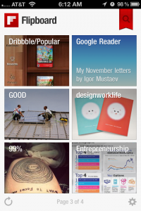
If you don’t have an iPad you might not know much about Flipboard. But that has changed! They recently released a version of the app designed for the iPhone. It’s an incredible content app that allows you to flip through content as if it were a magazine. Your favorite tweets, Facebook feeds, blogs & even websites all in one handy little app.
Flipboard is the most convenient way to read your favorite content from around the web.
iPhone App Changes
When I first downloaded the app, I was surprised to see that the pages flips from bottom to top instead of like a book. Since most users on an iPhone use only their thumb to perform actions on the screen, it made a lot of sense why they changed this gesture. The red ribbon doesn’t show unless you are viewing the cover of the app. I think this could’ve been carried through too, but the magnifying glass makes a lot of sense as well. Maybe it if were red? It is a pretty important little icon. You can search for and add new content to your Flipboard from here. Deserving of a little color I think.
Minor Gesture Issue
The one trouble I seem to have with the gesture of flipping from top to bottom in some cases is my notifications panel drops down when I am looking to refresh the app. It’s a little too close to the top. I don’t see the need to refresh too often, but paging backwards can be an issue when your on the go and your flipping isn’t too precise. If you’re looking for a new favorite iPhone app, this one will surely be worthy of precious dock space. Download the App: Flipboard


