Looking for some examples of farm & organic, fitness, medical & counseling websites? Here’s a round-up of some well designed websites, large & small for your inspiration!
Farms & Food Co-op Designs
Greensgrow Farms
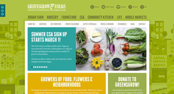
The use of color in all the right places is brilliant on this farm website. Don’t be afraid to incorporate bold colors into your design.
Earthbound Farm
These guys do a great job at directing your focus to specific places. Clearly their main goal is to get visitors to sign-up. Make sure you are emphasizing your goals with your website design.
Organic Prairie
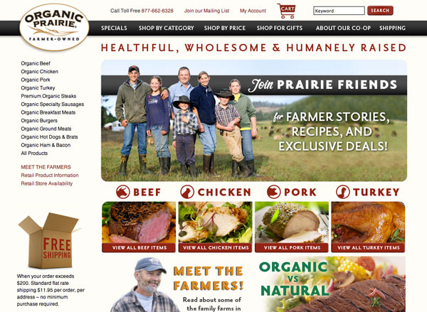
The design of this website is very family friendly, giving it a personal, trustworthy feel. They are also doing a great job making sure all links & buttons are red so their visitors know what they can click on.
Straus Family Creamery
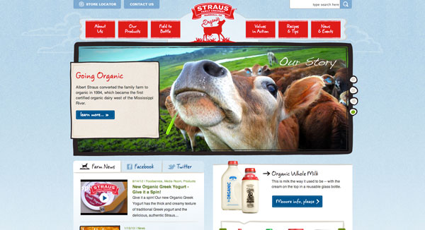
The Straus website is well organized and uses a lovely color palette. It feels fresh, wholesome and organic. Everything their products offer!
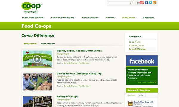
Stronger Together
This co-op organization helps bring co-ops together and educates visitors about co-ops. It’s very easy to use and well organized. The clean design makes the organization feel very credible.
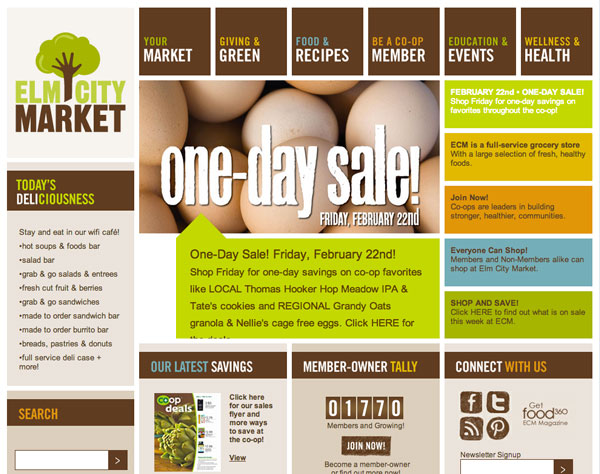
Elm City Market
Love the unique layout of this website and the use of colors.
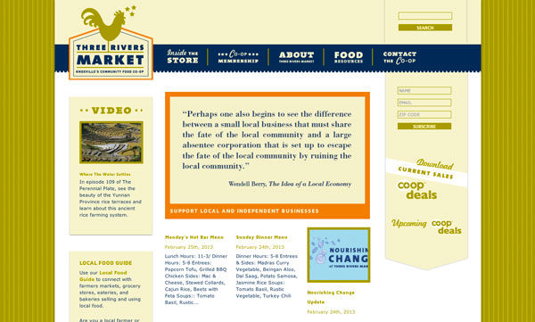
Three Rivers Market
The design of the Three Rivers Market website is quite unique indeed. The typography is creative and inviting and really gives Three Rivers Market a brand it can call it’s own. The hints of orange drawn your attention to specific places on the website very well. Might have pulled it into the buttons in some places for even more push towarrd important elements.
Healthy Foods & Product Website Design
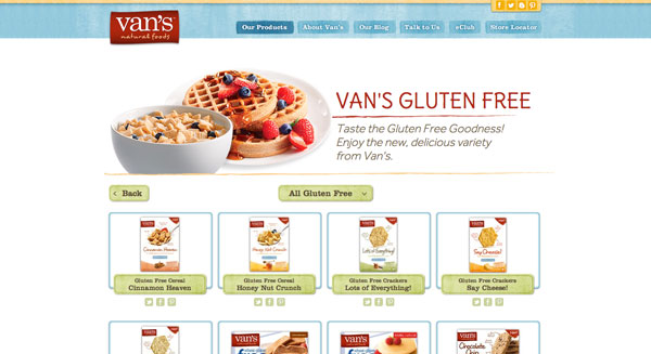
Van’s Foods
Textures can help add some personality and depth to your website. Van’s uses a subtle yet organic feeling texture to enrich the look of their website. The color palette is very inviting as well.
Dagoba Chocolate
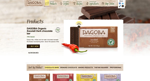
Who can say no to chocolate? I certainly can’t. My favorite elements on this website are the great uses of interactivity. If you drag the marker on the chocolate bar you can unwrap something delicious & organic!
Rudis Gluten-Free Bakery
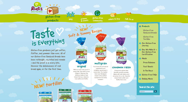
Who says gluten-free products can’t be fun? The number of people in the world who are sensitive to gluten is on the rise. Rudis is taking a fun & light-hearted approach to branding and does it well with illustrations and bright colors. How can you make your products appear enjoyable to your customers?
Annie’s
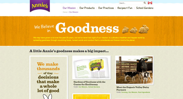
The typography and textures on the Annie’s website are quite beautiful. The use of hierarchy in typography really helps guide you through each page. Using larger headings and smaller type for less important content will draw your eyes accordingly. Big to small.
Fitness Website Design
CrossFit Minneapolis
The textures and minimal use of color on this website make it feel strong and tough. It’s clearly targeted towards men who want to improve their strength. They’ve done this with a combination of photography, color & texture.
YogaWorks
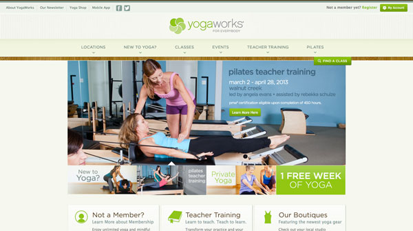
Can you picture yourself at the fitness center or gym you are interested in? Photos really do tell a story and can help your visitors connect with you. YogaWorks puts the focus of their website on their photography, which feels real & approachable. I would feel comfortable at their gym.
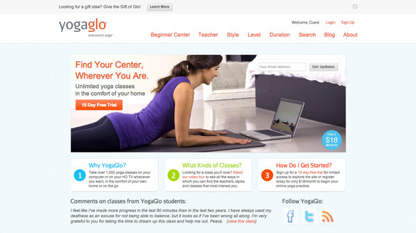
Yogaglo
For those who like to work out in the privacy of their own home Yogaglo might be the answer. They do a great job at appealing to a larger audience with subtle colors and very gender neutral styling.
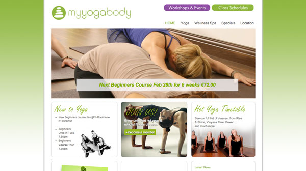
My Yoga Body
This website is very clean and organized. It’s easy to find key information and the use of photography is great!
Tennis.au
Trying to fit a lot of information into a small space isn’t an easy task. Especially content that is constantly changing. The tennis.au is organized beautifully without the content feeling too overwhelming. It’s compact, but well laid out. The blocks of blue color help give you eyes a break in just the right places.
Counseling Web Design Inspiration
I have to say that it was quite difficult to find well designed counseling, therapy & mental health focused websites. Differentiate your practice with design that will connect with people, the ultimate goal.
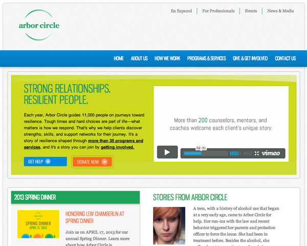
Arbor Circle
Arbor Circle uses video to capture their visitors attention. They use real people to send their messages, the perfect solution for a business based on helping others. Video testimonials feel more trustworthy than text quotes, simply because they are harder to fake.
Wedgwood
You can tell right off the bat that this organization is focused on serving kids & their families. Right away the smiling faces give me a positive feeling. The colors in the logo are pulled throughout the site quite well, adding to the family-friendly appeal.
Medical Website Inspiration
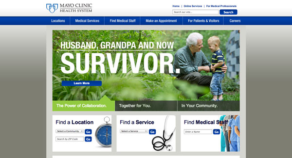
Mayo Clinic Heath System
Many hospitals struggle to fit a lot of content into one website. Mayo realizes this and has simplified the amount of content you see at once on their homepage. Don’t give your visitors too much at one time. Your website should guide them a little bit at a time to help them find what they are looking for.
Healthy Living Blogs
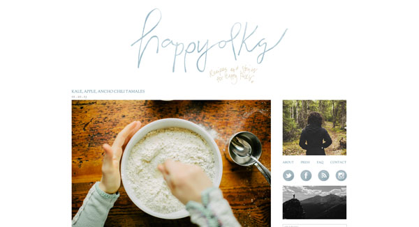
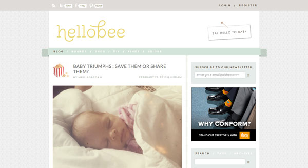
Here are a couple of personal blogs that are focused on food and healthy living. When it comes to blogging, photos are key, especially when writing about food.
