We are constantly learning new techniques on how to handle responsive design challenges. Each time we build a responsive website, we come across a better way to handle challenging content contraints. The more navigation, columns and elements present, the more scenarios you have to deal with on smaller & larger screen sizes.
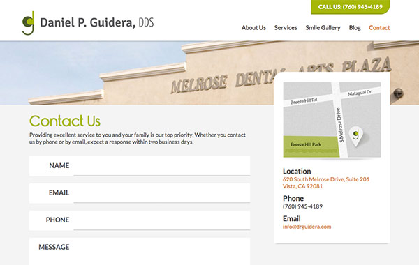
On the the biggest hurdles is handling sidebars. Especially when those sidebars contain important information that you don’t want to drop to the bottom of the website. Whether it’s navigation, a map or a call-to-action, sidebars can be challenging. Here are some scenarios in which sidebars hold important content and how it was handled with responsive design.
Responsive Sidebar Design Examples & Solutions
Pop-out Sidebar
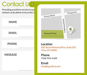
Another solution to keep a sidebar content compact yet visible is to use a pop-out tab. This is a take on the popular Facebook approach to slide out additional content on the right or left of the screen using a button.

Collapsed, Top Sidebar with Categories
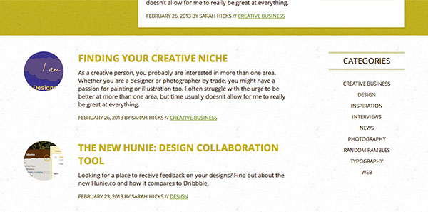
For blogs and news sections, categories are quite important to keep higher up on the page to allow for exploration. In this example, we have collapsed the categories and kept them at the top of the page so they are accessible, but not in the way of the main content.


Horizontal Shifting Sidebar Navigation
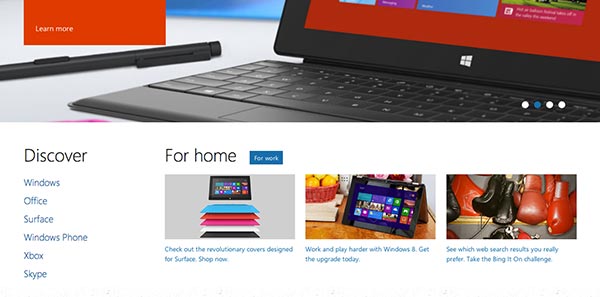
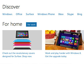
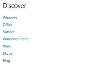
In this example, Microsoft takes navigation links and shifts them to a horizontal layout and back to vertical, depending on the size of the screen. This is a great way to keep a shorter list of navigational links on the top of the page without taking up too much vertical real estate.
