Here is a common question website owners have. A splash page (also called splash image) is typically used as an introduction to a website. The most common use of the splash page is when the homepage is replaced with the splash image or page design. When visitors type the homepage URL into the address bar they are redirected (most often, but it can be used as the homepage itself) to the splash image. The splash image does do it’s job in most cases. The splash is something surprising and interesting. It adds appeal to the site and can get the visitor excited. A splash page sounds pretty sweet doesn’t it? You probably want one on your site right now don’t you? But the question remains: When is a splash page necessary?
How to Correctly Use a Splash Page
I’ve seen splash pages used on a variety of different websites. Some are used very well while others seem to lack purpose or a goal. When there is no goal the splash page can act as a deterrent to the actual content leaving visitors wondering why they have to click an extra time to get to the content they actually want to see.
New Product Introduction
I like the idea of using a splash page to introduce a new product. You’ll see this strategy used on sites of musicians. They’ll use a splash page to promote new albums, songs, and merchandise. The nature of a splash page is that it eliminates distractions. There are typically no navigation bars or places to click other than the intended products. A good splash page will introduce a new product to the visitor. If the visitor is interested they can click and purchase or they can find the button to click through to the rest of the website as they original intended.
List Building
List building is important for any business. A list of customers. A list of subscribers. This is where your money comes from and you need to do whatever you can to build your list or lists. A splash page can be a great way to obtain more subscribers. It’s debatable if the homepage is the best point of contact to acquire new names for your list. Is a new visitor really ready to sign up for something the very first moment they arrive on your site? You’ll have to decide. In some cases it could be true. Maybe your splash page could first give an introduction and then recommend some content. Then you can ask for an email address and possibly offer something like a free guide or free song or something to further entice.
Be Careful with Video and Sound
One thing that iritates me and I’m sure it does others as well is video and sound. I don’t like to visit a homepage on a website and immediately be blasted in the face with loud noise. It’s not a pleasant experience. I don’t care if I’m going to the website of an action movie. I’m looking for content and not video that immediately plays. Give people the option to start video and sound. I would say that it is Ok to have a video play, but give the visitor the option to turn the sound on.
Colt Ford
 Colt Ford is a country rapper. I like this splash page. Colt is promoting his most recent concert tour and upcoming album release. Colt knows where he makes his money and that is out on the road with his live show. Here he’s showing visitors to his site the upcoming dates. There is a purpose to this page. It makes visitors stop and consider the content and then allows them to move on through to the rest of the site.
Men In Black III
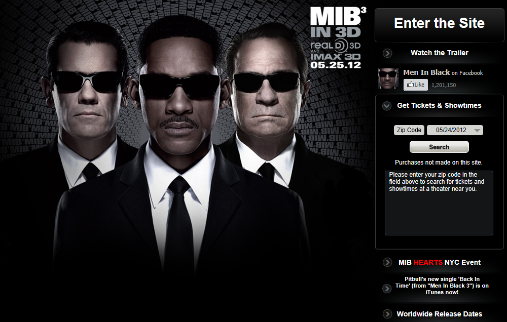
 Men In Black III was recently released. The movie’s website had an interesting splash page. They focused on the trailer, the showtimes and locations, but also on getting likes on Facebook. It’s similar to list building although creating an email list might have been a better option. It’s still a pretty good page that gives visitors a few options before they enter the main site.
New Jersey Devils
 Here is a pretty cool page. The Devils are currently in the NHL Finals. Things are getting exciting for the fans. It’s the perfect time to try and sell a few more season tickets. This is probably the most common way to use a splash page. It works as a landing page that limits choice and focuses on selling something, which is what businesses try to do in the first place. One last thought – be careful with splash pages. I would say not to use them unless it’s for a specific reason. Have a purpose for the page otherwise just let users visit the homepage. Now let’s get to talking. Have you used a splash page before? Share your thoughts on splash pages in the comments. Are splash pages good or bad?


