Throughout 2011, responsive design has been the talk of the town in the design world. Jeffery Zeldman, recently published a very thought provoking article (State of the Web: of Apps, Devices & Breakpoints) about responsive design and whether or not breakpoints were no longer the way to go about designing. I thought I would share my thoughts on the ideas discussed in his article. Breakpoints are the different viewport sizes (eg. Tablet or Smartphone). They are controlled by CSS to display a website in different ways based upon the size. The trouble with designing only with a few breakpoints is the number of devices that don’t quite fit the standard sizes. Zeldman mentions Android devices as an example. There are so many different screen sizes on mobile devices that it’s nearly impossible to target each one.
 So, is Responsive Design Already Outdated?
I think it’s important that we think of responsive design as a stepping stone to a new methodology. Just as CSS began, it grew into a much more powerful language. I think we need to take a responsive approach, targeting key devices sizes based on the most popular of sizes. But, we also need to take into consideration everything in between. When a visitor is coming to your website and is using an odd-ball sized device that you haven’t considered in your plan, they should still be able to view the site as it was intended to be viewed. Or at least as close to it as possible.
This idea of flexibility brings us back to the days of fluid design. Before I even started in web design. Fluid design was practiced back in the 90’s and early 2000’s is based entirely on percentages and ems and doesn’t utilize media queries (media queries are used to define breakpoints in a responsive design methodology). I think we need to consider both methods and combine them for the best results. When I first learned about responsive design, I always thought that was the point of responsive design. In such a fast-paced mobile market, we can’t possible keep up with every new device that is released.
Instead, we should focus on ranges of sizes and make sure the transitions in between are smooth as well. This may mean making websites much simpler and light than we have in the past. Designing with mobile in mind from the beginning is going to become standard practice, if it isn’t already.
Will There Be Mobile Device Standards?
Zeldman discusses the possibility of mobile standards. Will mobile device creators ever fall victim to the practice of standard viewport sizes? If they do, I don’t think it will happen for some time. In turn, making web design extremely challenging. But that’s half the fun isn’t it? With the level of innovation high in the mobile market, I believe setting standards will be a challenge unless the pace slows. I don’t think we should hinder the choices consumers have because we can’t control how it looks on every device.
It is frustrating as a designer, but I think would be even more restricting to consumers. Shouldn’t they be able to use their favorite devices based on what they want versus what we think they need? I think we need to once again, re-adjust our processes to fill the demand for beautiful designs across multiple devices. It’s a challenge I am willing to take on.
Recent Project with Responsive & Fluid Design
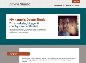
 DayneShuda.com is a personal site for marketer & blog writer Dayne Shuda. He was willing to let Sarah Lynn Design use some of the latest design techniques on his site. You’ll notice that the site is mostly fluid, with the exception of one media query setup for 480px and below. There is still a bit of work to do to smooth out the transitions from 960px to the 480px viewport size.
You’ll notice how the content is adapted for a mobile phone yet still looks decent everywhere in between. This method is fairly time consuming and requires a good amount of planning. It’s a fairly simple site too. So with that said, a much larger site, with many more complex features and more user generated content would be a touch more difficult to pull off with this methodology. Using both media queries and a fluid design approach, I think we can, as a design community, accomplish the challenges that lay ahead of us in 2012 & beyond.


