Today we’re taking a look at a top-notch destination website for North Carolina. It is jam packed with valuable content and does a lot of things really well including advertising, providing seasonal content & mastering trip guidance.
Trip Ideas

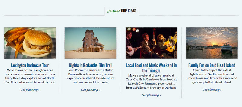
One of my favorite aspects about visitnc.com is their trip ideas section. Planning a trip to a destination you’ve never been before can be daunting. How long should you spend at each place? What are the top spots to visit if you love wine or want to experience the best local cuisine?
Instead of making visitors search through hundreds or even thousands of listings, these trip idea itineraries are incredibly helpful. They are providing value to their visitors while still pushing out fresh content, much like a blog.
What ways can you create and share content for your destination to help your visitors?
Get Seasonal
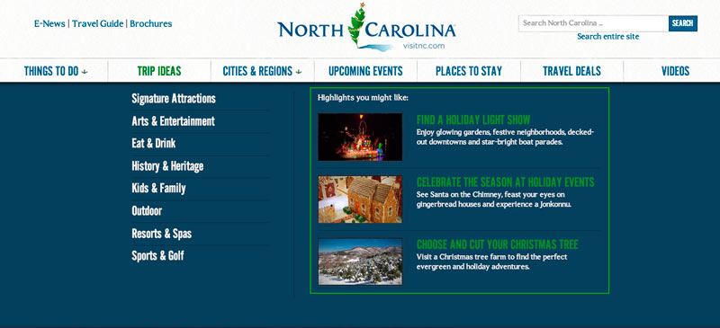
Throughout visitnc.com you’ll notice a few ways they are providing seasonal content.

This does two things for their site:
- Shows they are constantly updating it and the information is new and relevant.
- Allows businesses that may only operate in winter to have their time in the spotlight.
Non-Intrusive Advertising Display

In many cases, advertising means more revenue to invest into tourism marketing efforts. But how can you display ads in a visible yet non-intrusive way?
Visitnc.com displays ads as you start to scroll down any page on their site. The ad slides up from the bottom, putting it directly in the visitor’s line of sight for prime visibility.
The space also includes a close icon in the upper-right corner so visitors can hide it if they wish. This feature is especially crucial for mobile visitors with less screen real estate.
Site-wide Search
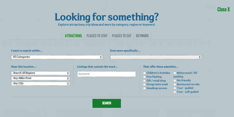
For a state-wide destination website, search is very important. The more you can guide your visitors the better with such a large amount of business and activity listings to contend with.

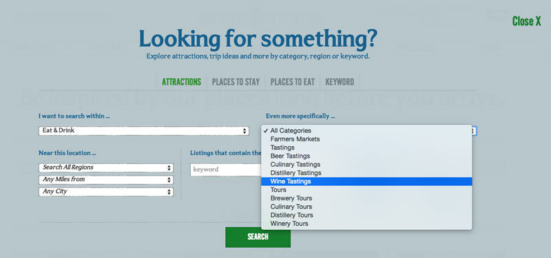
Not only can you search by category, but you can refine your results even further by using a secondary sub-category (shown below).

Another bonus to their search setup is that you can access this panel from any page and keep your current page location if you decide you don’t want to search after all.
Room for Opportunity?
This destination site is doing so many things well it’s hard to pinpoint a spot for future growth. One thing they could consider doing to offer another avenue of discovery is to include a section much like their video section for photos. I love that they integrate a photo browser within the different sections of their business listings currently. Perhaps an easy update would be to link those photos and their captions to more actionable pages so when visitors like what they see they can learn more about the event or attraction.
What else can you takeaway from this top-notch travel website?


