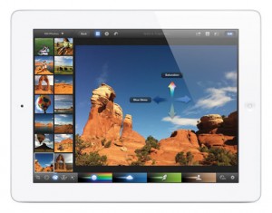
As you may have heard, the new iPad was just announced earlier this week. Apple threw its revolutionary wrench out there again. Right into web designer’s workflows. The new iPad’s screen resolution is a mere 2048×1536 pixels. Compared to the iPad 2 which is 1024 by 768. What does this all mean? Well, like the iPhone 4, the display will be crisper and you’ll experience more details in every nook and cranny on the new iPad. The exception, for probably quite some time, will be your web browsing experience. Technology, as usual, is speeding along faster than we can keep up with. 
Responsive Design
Responsive design takes one set of content and adapts to the specs of the device it is being viewed on. For instance, if you are viewing a website on your iPhone, there will be no need for zooming, pinching or squeezing. You’ll be served the mobile optimized version of the website.
The trouble that comes with the new iPad is that the screen resolution will cause images that were provided for the desktop version of the website to look blurry and pixelated. This is because we are dealing with multiple screen resolutions. The images that were initially designed for the desktop browsing experience will not match up with the high resolution requirements of the new iPad. The higher the resolution, the larger the file sizes become.
Apple’s 3G download limit is 20MB. This poses a huge problem when someone is using a 3G connection to download the higher resolution images for their iPad. And, there’s the wrench…
What Does This Mean for Designers?
For web designers, the new resolution means we need to create multiple sets of images and serve them up to the appropriate devices. This needs to also be done for the iPhone 4, but it’s much less noticeable due to the smaller screen. The new iPad will be much more noticeable. The web browsing experience will be a bit hazy for a while until designers and developers are able to crank out imagery at 2 times the resolution. Brad Frost writes,
Just because the iPad3 CAN serve up high quality, crisp images and video doesn’t mean it SHOULD for every use case. This is important. We need a way to properly address this.
Loss of Space on iPad
For users who love their apps, this means more space will be taken up by higher res images. Downloading an app will take longer because of these increased image sizes.
User Generated Content
With multiple screen resolutions to worry about, how will user generated content, such as images uploaded on blogs, be handled? Today, images can be scaled down proportionately. It doesn’t matter whether they were uploaded by a user or not. But when a user uploads a photo that looks great on a desktop, but isn’t high enough res for the new iPad, then what? Do we have bloggers upload an even higher resolution image to support the new iPad? Then desktop users may experience slower load times. Lots of things to discuss – I’ve love to hear some feedback from those in the web community.
What are your thoughts?
- How do we address these problems while still moving forward with responsive design?
- What does this mean for users purchasing the new iPad?


