Give your customers what they expect, when it comes to making their way around your website. With so many online shopping options, customers don’t have to put up with confusing navigation or unintuitive shopping carts. Make sure you’re guiding your customer in the right direction and not causing them to leave your site.
“What does color have to do with it? Everything.”
Some of the most successful retailers use color to help guide their customers through their site. Where do you want your customer to look when they are ready to checkout? Make sure they are looking in the right place by adding color in the correct places. Using colored buttons and contrasting colors in your website’s navigation can dramatically help your user’s customer experience. The same way aisle signs and section banners in a retail store guide customers.
Using Color to Guide Your Customers
Let’s take a look at some examples of how color is used by some of the most successful online retailers on the market today.
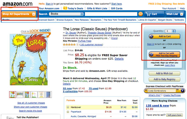
Amazon, known for their incredibly smart and user friendly shopping experience, uses different colors to gauge the importance of their buttons. As you can see both add to cart buttons are designed to appear brighter and more saturated in color than the add to wish list and baby registry buttons right below.
Also notice the blue coloring behind this extremely important panel of options. Not only do the buttons guide the eye in this area because of their contrasting colors, but the blue background helps to break-up the white space and pull the customer’s eye to the right as well.
You’ll also notice in the upper left-hand corner, shop all departments is given a bright orange color. When on any other page besides their homepage, the navigation collapses to make way for a more narrowed list of search results, based on the section of the store you’ve chosen. Amazon wants to make sure their customers are aware that their main shopping categories are still available and easily found when collapsed.
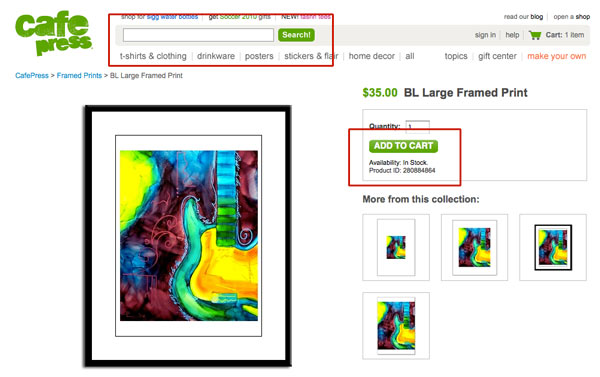
Cafe Press does an excellent job utilizing color where they want their customers to take action. With a minimalist design style, the other, less important links are presented in subdued colors allowing for less confusion and overwhelming feelings from visitors.
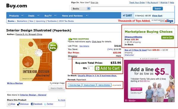
Buy.com follows suit with Cafe Press and allows their products to stand out on their own with a minimalist style of design. Again, green is used for the most important elements on the page. If you look at the print this page, email a friend and add to wishlist buttons, they are a lighter shade of blue and less saturated than the add to cart button above. Usability design is extremely important when it comes to getting a customer to checkout. Your customer should have no problem finding their shopping cart and adding an item to it.
If the checkout buttons are not visible to the shoppers or they do not stand out in some way from the rest of the page, you will have a difficult time converting many of your shoppers to buyers. -eCommerce Optimization
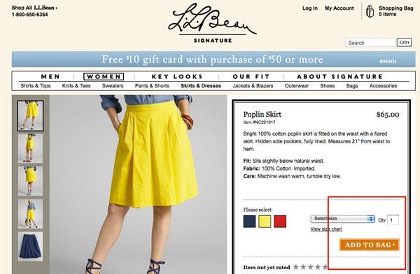
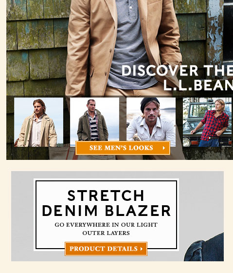
The L.L. Bean Signature site has an excellent overall design. They use the color orange to showcase when their customer’s should make an action. In the examples above, It is important to keep the color consistent throughout the site as customers will eventually become accustomed to orange and what the color is associated with. 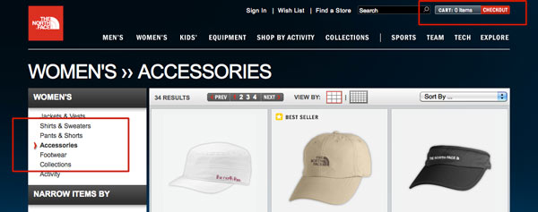
Navigating through the North Face website is like riding a bike with training wheels. There are always three ways to know what page you’re on, made apparent by the color red, large fonts and the use of effective bulleting and overly large bread crumbs. Similar to the other examples, only one color is used to represent the shopping cart related actions.
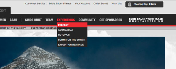
Eddie Bauer (above) and First Ascent (below) use color to highlight the background of the active page the user is on. Eddie Bauer also is using color to highlight the active page in yellow. The more consistent you can be with your color choices, the easier it will be for your customer to shop!
Usability Takeaways
- Always give your customers a clear indication of where they are on your website. Color is a great way to do this.
- Make sure there is some differentiation between common buttons and buttons that have specific actions (IE. shopping cart functions).
- Choose one color to use to assist in guiding your customer. This way they know what to expect.
- Use more than one option to show your customer where they are (IE. breadcrumbs, color highlighting and large title headers)
