It’s easy to overlook pages that aren’t always visible on a website. When building a website you might often start thinking about high-level pages. Those might include a homepage, about us page and a contact page. But there are a few pages that often get overlooked when building and planning a website.
Here are a few pages that tend to get overlooked:
404-Error Page
The 404-Error page is displayed when a visitor to your website types in a URL incorrectly or is directed to a page on your site that no longer exists. The default settings for this scenario is a white screen with an error message.
-

- Default 404 Error Page
Why should you care? What’s so bad about the above page?
- Keep the visitor on your website – A blank screen with some gibberish and no signs of your website’s branding will leave the visitor feeling lost.
- No explanation as to why this is happening – Suggest a few reasons why they might be encountering this page so they don’t think your website is filled with errors.
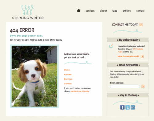
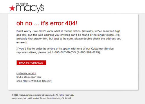
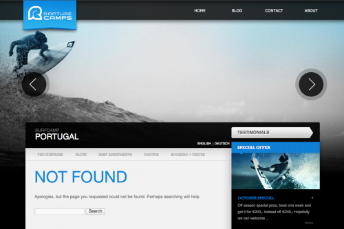
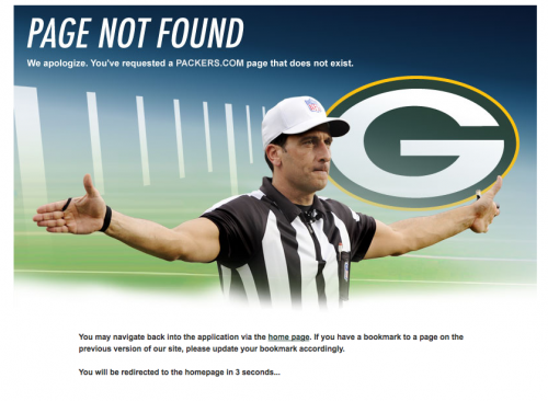
Examples of a Successful 404-Error Page
If your website has a lot of content or products, a search bar can be a great addition to your 404 page.
Packers.com redirects their visitors immediately to the homepage when encountering their 404 page.
Confirmation Pages/Emails/Messaging
These are the pages or messages you might encounter after you sign-up for an email, submit a contact form, request further information or sign-up for an account. They should make your visitor feel that they successfully completed the task at hand. No questions asked.

A contact form confirmation page or message should indicate how long it will take before the visitor can expect a response. If the form is to apply for a job or request a catalog, you might want to include what the next steps are, how long delivery might take, etc.
Don’t leave your visitor with a head full of questions. That will only put more strain on your customer service department.
Search Results Page
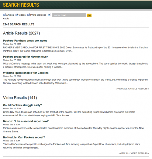
For many online retailers, the search results page is of very high importance. But, for many smaller websites, search may not even exist or have a huge impact due to the size of the website. I came across an excellent example of how to return search results on a content driven website vs. a site focused on selling products or services.
The Packers.com search results page separates different media types making it even easier for their visitors to find what they ae looking for. Separating out different media types when you have them available is incredibly smart. Travel websites could take advantage of this setup. Especially when many people do want to see videos or photos of where they are headed to first, before they spend their hard-earned savings to travel.
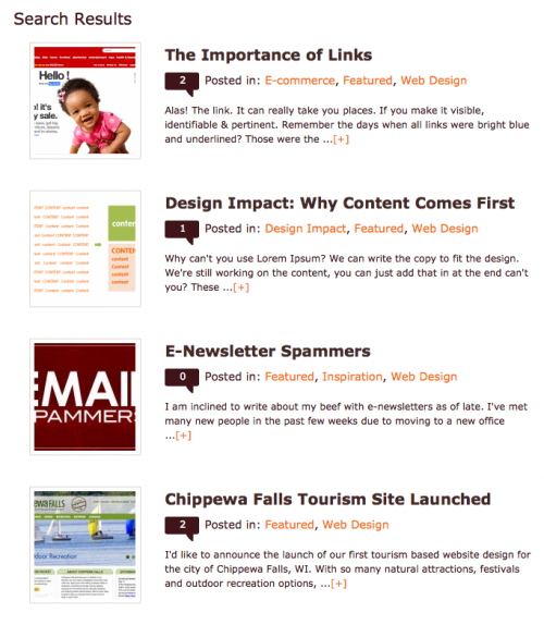
When returning search results, it’s important to consider the way the listings were first displayed. For example, if you’re searching a blog for a specific term, you’d want your search results to look like small blog post excerpts, if that is how posts are typically displayed on your site. This will allow your visitor to search based on what they are already used to seeing. Familiarity isn’t always a bad thing, especially when it comes to crucial elements like search or interface design.
When you work on your next web project, keep these pages in mind. It’s better to cover all your bases than to leave your visitor lost or in unfamiliar territory. Remember to provide clear navigation and help them find what they are looking for. No matter what human errors occur or what they are searching for.


