If you ask Sarah she will confirm that I’m a stickler for throwing things away. I guess it’s the opposite of hoarding or something, but I really dislike clutter. When I lived in a one bedroom apartment – my own bachelor pad – the walls were pretty bare and white. The living room had two places to sit. The counters in the kitchen had nothing on them except for a microwave and coffee maker. The refridgerator only had enough food for one person for one week.  I try to live by the “Less Is More” mantra.
Sure, I have “stuff” just like anyone else. I have golf clubs and hunting supplies. But I try to keep my stuff to a minimum and throw out anything I don’t absolutely need in the near future. With websites, I try to keep the same basic principle. A recent article from Conversion Rate Experts (also a hat tip to Crazy Egg) touched on this very subject and I thought it was worth highlighting their study while providing my own thoughts and tips you can use with your own website design and maintenance.
Remove Clutter From Your Website
Here is a snippet from Less is more: how we used Crazy Egg to boost our own conversions:
However, also notice how we were getting some clicks on the right sidebar area. It wasn’t red-hot, but we still got a noticeable number of clicks.
We realized that our site-wide sidebar was distracting some people from the task at hand, which was to download our free toolkit. We were practically asking them to click off to the right and not stay on topic.
When your website visitors aren’t doing what you intend for them to do (make a purchase, contact you, etc.), it’s time to consider making changes.
Goals for Each Page
Each page on your site should have a goal. In general, each page on your site has the singlular goal of earning your business profit (or if you’re a non-profit, more donations or contributions). With this goal in mind you have to break down how each page on your website will achieve profit. For your home page this means you have to introduce your brand to a new visitor.
Just as a salesman will work his or her magic on a new customer, your home page must act in the same manner. An introduction should be made. A determination should be made between the salesman (website) and potential customer (site visitor). If it is determined that the visitor is ready to buy that option should be available. If the visitor is obviously not interested they are free to leave (people are good at leaving websites for other sites). If the visitor needs more information there needs to be a clear path to acquire this information. Sarah and I worked through this process with the redesign of Ghost Blog Writers.
The goal was and remains: maximize profit. I wanted new visitors to the site to understand what GBW did within the first few moments. The headline is: Custom Blog Content Hopefully this is straight forward to new visitors. I’m always open to changing this if it is unclear. What I have found to be the most profitable method of acquiring customers up to this point is to offer a free sample article. This allows GBW to prove its worth without risk for the potential customer. This call to action is right at the top.
What if a new visitor isn’t ready for that commitment yet? I thought we could provide a service list, pricing, testimonials and a link to a blogger’s beginner’s guide. These are all aimed to move the visitor down the sales funnel as they gather more information during their research. The ultimate goal of the site remains the same: make profit by getting visitors to contact GBW.
Even as I look at the site now I have to say…there is probably room to remove some clutter. I ask myself these questions: Does the guide area need that much space? Are the testimonials needed? Is the pricing area too big? Could the results area be smaller or is it even necessary? I’ve answered these questions before while working with Sarah and it’s something I always reconsider. At the time I determined these elements were necessary. If I determine that something is unnecessary or distracting then it’s time to make a cut and remove the clutter.
Country Music Life
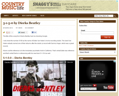
Just today, I made another clutter cut on Country Music Life.

I asked myself the same questions as with other sites: What is the goal of the pages on CML? What can be removed? What is distracting? The main goal of the site is to profit from advertising. I also use the site as an example for Ghost Blog Writers, which is a main goal, but for CML on its own, I look to make profit. I worked my way backwards from profit and determined two main objectives that lead to profit:
- Subscribers
- Advertisement Clicks
With these goal in mind I took a good look at the sidebar. I removed all links to other pages on the site. Too distracting was my determination. I want new visitors to the site and specifically to each blog post to read the article, listen to the song, and then subscribe to future updates. The email subscribe now stands out more at the top right of the page. There are also links to other subscription choices. A simple archive drop down remains so people can discover more content.
The search bar is also available for this purpose. I put an ad at the top and an ad on the right. I want people to click on these ads. Less clutter on the sidebar and the page means more attention to these ads. Less clutter. More correct actions. More profit. Happy me.
The Big Takeaway
Remove clutter from your website. Consider what the goals of your site and its pages are and make adjustments. Profit likely drives your decisions. Consider the items on your website that drive the most profit. Cut the rest.
The process of clutter analysis is ongoing. You’re never done tweaking. You want to always consider ways to make your website better.
Remove things. Add things. Focus on the goal for each page and you should be in good shape. And Sarah understands this concept well so she can help you with the process. Now, I have to get back to a little spring cleaning…
About the Author: Dayne Shuda
Dayne Shuda is a content strategist and blogger. He is the founder of Ghost Blog Writers. Website: http://www.dayneshuda.com Twitter: @DayneShuda


