Responsive design has become a very strong contender in the mobile market. Here are some examples of how others are handling responsive navigation. There are many ways to do it and all have their benefits and downfalls.
Main Navigation
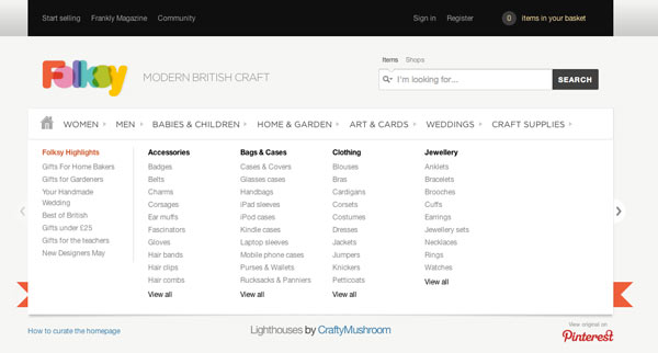
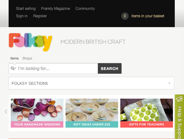
Folksy E-commerce Responsive Navigation
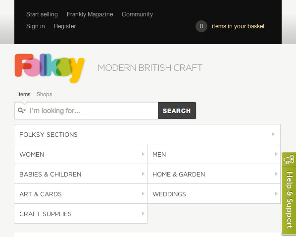
Above, Folksy uses a collapsable design to handle their flyout navigation menus. This is a great way to save space and keep the design as similar to the desktop version as possible. Pushing too far can cause usability issues for those used to finding things in certain spots from one device to the next.
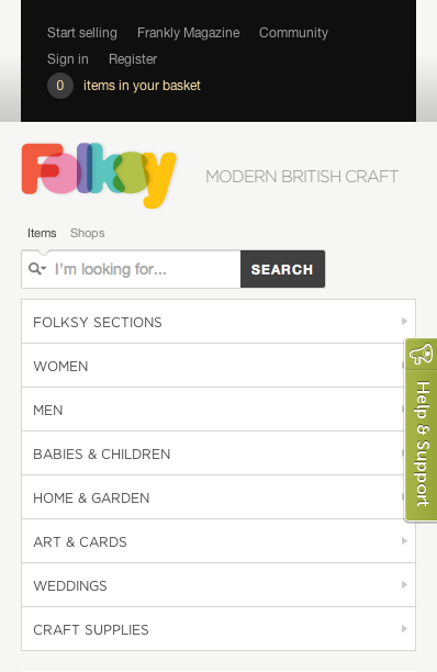
Folksy does a great job making sure to make their mobile navigation links clickable. The rule of “thumb” is to keep a width of about 44 pixels wide so a user can use their thumb to click and not accidentally hit the link next to it.
The top links may be somewhat difficult to click, but they are more utilitarian in purpose so that’s ok.
SLD Navigation Design

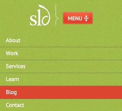
On our SLD site, we utilize a expandable mobile navigation menu for both our main nav and sub-navigation. Using a double arrow helps to emphasize that you can click to show and to hide.
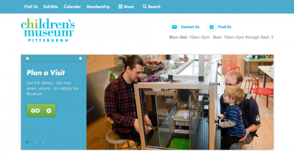
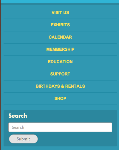
Pittsburgh Children’s Museum

Above navigation brings the user to the bottom of the page to view the main nav links. This is a great way to avoid using additional javascript to show and hide a menu.
Beyond Tellerrand

beyond tellerrand keeps their main navigation at the top of the page and expands it downward upon clicking. They also use the “Facebookesque” style of icon to represent the navigation, much like the museum example. This icon has been popping up more frequently and is a very user-friendly way of handling it. The more recognizable icons become, the better for all users.
Responsive Product Filtering & Left Nav Menu
Folksy Responsive Product Refinement Menu
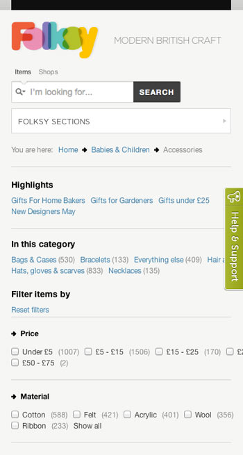
Product refinement can be fairly difficult to pull off. I have yet to see too many retailers that are taking a responsive approach on their websites. Especially at this scale. A mobile app may offer more flexibility and customization but it certainly wouldn’t hurt to go both routes if your budget allows for it.
Looking at the product refinements that Folksy uses, some of the options may end up being difficult to click for some users. But, on the flip-side, the don’t have to search to figure out how to refine what they are looking for. It basically says, “what do you want, we’ll grab it for you” rather than allowing the customer to browse products first.


