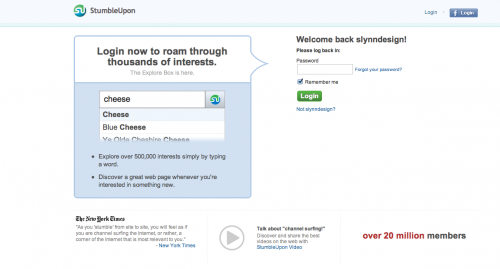
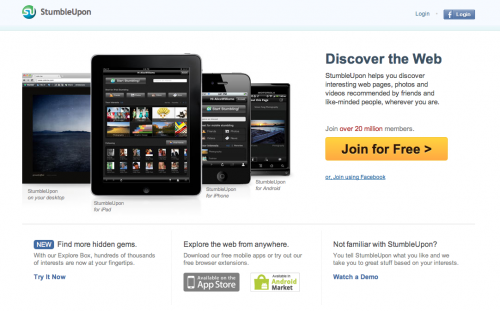
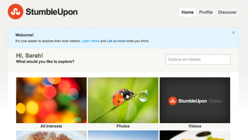
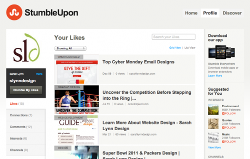
Today, StumbleUpon released their newly rebranded website to the world. Including a new logo. I was surprised to see they changed their core colors that have marked StumbleUpon for many years. Let’s take a brief look at what was updated.
Above: Before the Re-branding
In With the New
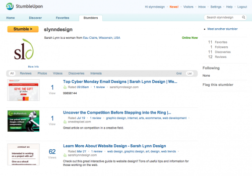
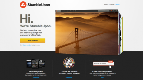
Above: After Re-branding
Design for Users
Overall, the updates to the homepage, navigation and organization of their web interface has vastly improved. When using the old version, I always had trouble finding my shares and favorites. Updating my profile was also a pain. Now, it’s easier than ever with the large “profile” tab at the top. They’ve obviously done some user research and determined the top pages that needed to be emphasized in a big way.
New Logo Design for StumbleUpon
I have to say I am a big fan of the simplified logo for StumbleUpon. Although I was a little taken by the change of color. I would have suspected they would stick with the teal or blue. Maybe Facebook and Twitter have stole their thunder as far as colors go? Anyone know why they switched to orange? I’d love to hear the reasonings behind the huge shift in branding. As you probably guessed, I’m a big fan of orange so I like the new color palette they’ve chosen. But it’s a risky switch considering how many customers probably have a SU icon on their website in the traditional colors. May take a while before the switch is also changed around the web. Not sure if that was the right move on their part.
Another “Channel” for Content Distribution
StumbleUpon has also released Channels in the Discover section of the new site. Similar to Twitter, you can follow certain channels and read the content they have chosen to share. Not incredibly different from many other types of social sites. Just another way to share content with the world.
