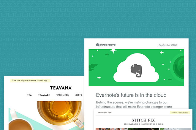
A great email newsletter can come in variety of different forms. But, there are certain components that are necessary to include for the best chance at success.
Let’s look at the anatomy of an well-designed email newsletter…
Pre-header
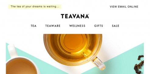
The pre-header text is the first copy in the email. It’s automatically displayed along with your subject line before your reader opens up your email. For this reason, it’s very important to make an effort to include it and spend time writing descriptive pre-header copy.
Q: Can I hide pre-header text?
Pre-header copy can be hidden from view if you are working with raw HTML or have a developer on your team creating custom emails for you. This is a great option if your brand’s styling leans towards simplicity and you would like to make every effort to focus your reader’s attention on your primary message.
View in Browser Link
The view in browser link is helpful if your email isn’t displaying correctly for your reader. A common issue is images not being displayed.
This link is helpful if you have an audience that isn’t terribly tech-savvy. They might be someone who wouldn’t know how to turn on image viewing or keep their computer’s software updated.
Q: Should I place this link at the top of the email or in the footer?
Header: The primary reason for placing a view online link at the top of your email is if your email isn’t displaying correctly for your viewer. Or if you sent out an image heavy email and the images aren’t turned on in your subscribers email software they may click it to see the email how you intended.
Another reason for displaying a view online or view in browser link at the top of your email is to provide a link for your subscriber to share the email outside of their own inbox. Some email service providers, such as MailChimp, include some additional features on the view in browser version including: view past issues, share on social media, and email translation.

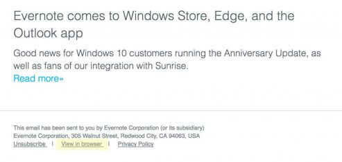
Footer: The below example shows placement in the footer of the email. This is ideal if you thoroughly test your emails on a regular basis and know your email will display correctly and you consider your audience to be fairly tech-savvy.
If you plan on including your own email share or a forward to a friend link you could also move your view in browser link to the footer.
While it’s not a requirement to include a view in browser link at all, it’s good practice.
Header
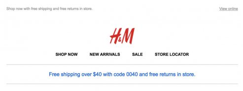
The header of your email is where you should include your company logo at a minimum. Make sure your logo is linked back to your website or another relevant landing page based on what you’re sending. A common mistake is to leave your logo unlinked which can be frustrating if your reader wants to make a purchase or shop your site and isn’t interested in what you’re specifically promoting in the email.
Try to carry through the same design styles you use in other marketing materials so your reader knows it’s from you without having to think too hard. This will help you avoid being flagged as a spammer if they don’t recognize you.
Q: Should I include my website navigation in my email header?
A: Yes and no.
Remember your email isn’t your website. It doesn’t need to be navigated in the same way a website would. If you’re trying to promote a specific product or sale, adding navigational links can distract your customer from your ultimate goal.
If you’re a retailer, I would suggest including a few of your most popular navigation links in your header but it’s not necessary to include them all. Make it relevant to what you’re promoting in the email. And remember, every audience responds differently. Test out different link combinations to see what works best for you.
You may also be interested in reading: Should You Include Website Navigation in Your Emails?
Primary Content
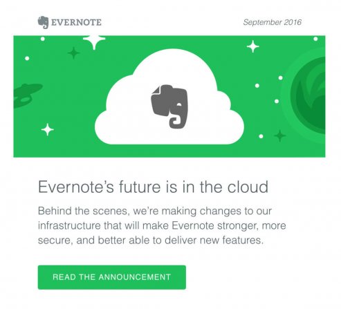
What is the primary goal of your email? What are you hoping to achieve by sending out your email?
In the above example, Evernote has a clear goal of communicating new product changes to their users.
Primary Visual – A graphic or photograph can often communicate a message more quickly than its text counterpart. The attention span of many email readers is short so focus on getting your point across in as little text as possible. A great visual can help in this department. In the example above, It’s clear Evernote is focusing on their cloud product at a glance.
Short and Concise Copy – In most marketing emails, short copy is the key to success. Allow your website’s landing pages to do the heavy lifting after your subscriber has clicked-through from your email.
You may also want to check out: 10 Tips to Write Great Email Copy
Clear Call to Action – A primary call to action is most commonly a button or link. It should be prominent and allow your reader to take an action that directly supports your primary goal.
Secondary Content
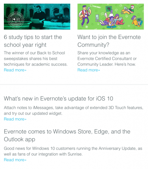
Your primary content may not appeal to everyone on your list. Or you may have additional, less important content to share.
Evernote does a great job of making their secondary content feel less important by using smaller thumbnail images and laying out the content in two columns.
Secondary Calls to Action – Use a different button style for your additional calls to action. I recommend going with a smaller button at a minimum. You may even choose to use a different color and a smaller font size as well.
Another great way to differentiate your secondary calls to action is to use text links if you’ve used a button for your primary call to action.
Footer
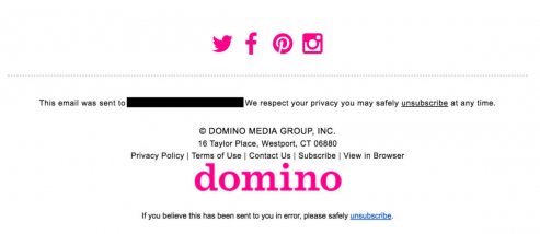
Q: What am I required to include in my email to abide by CAN-SPAM laws?
Your email footer needs to contain the following:
- Unsubscribe link
- Your business mailing address
While not required by law, it’s good practice to also include:
- How the subscriber signed up
- Update subscription link
- The email address the email was sent to.
This may seem repetitive, but some subscribers may have multiple email addresses. If they want to update their subscription it’s easy for them to see which address is currently subscribed at a glance. - Terms and conditions
- Copyright and business name
Q: Why would I want someone to unsubscribe?
If your subscriber isn’t interested in hearing from you anymore, the best thing for both of you is to part ways.
Every subscriber costs you money. If your subscriber isn’t going to buy from you and is telling you they don’t want to hear from you, why would you want to pay them them to be on your list?
You risk hurting your sending reputation if you don’t allow unsubscribes. Every subscriber has the potential to mark your email as spam, hurting your sending reputation. The more unhappy they are with your emails, the higher the risk. Find out more about the dangers of emailing an inactive list.
Happy emailing!
