What will you need to help your online retail business’ design succeed?
Details
Show-off your products details, don’t be shy! Zoom in on important elements. Especially when your customers can’t physically hold the product. They want to see different angles and close-ups. If you can eat it, wear it, or you’ve got a big price tag, make sure and give your customers the full experience as if they were in your physical store. Are there multiple colors and options per style? Show how they all will look and make sure they resemble the actual product! No customer likes to think they are buying a red sweater when its actually dark pink. Be upfront and clear with your customers.
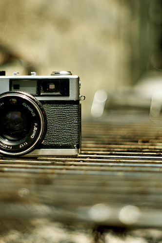
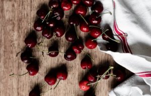
Photo by Steven Fernandez
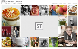
Photography is KEY Zoom in on that special fabric or gold trim. Show your customers why your product should be their choice. Don’t skimp when it comes to your photography budget. It is VERY important. Keep the style you shoot in consistent across all mediums. If your selling food products, make sure and present it in a flawless fashion. I came across a very talented food photographer a couple of weeks ago who’s been very friendly. Shawn Taylor‘s photography is absolutely breathtaking and delicious! If you’re looking to hire someone to shoot your business’ products consider his talents. You can visit his website below with samples of his work.
Have a plan of your overall design before wandering off into photography land. Develop a color palette first, before signing up for a photography session. Try and incorporate those colors in elements surrounding your products, especially for a homepage hero image (feature image). This way your photography compliments the other design elements on your website. Bring it all together and give your online presence at boost!
Focus
What is your focus? Is their a particular characteristic that you’d like to draw your customers attention to? Or do your products have such unique features that you’d like them to be the main focus? Say for example your selling bed linens and your using a highly specialized material to give your linens the softest touch. Maybe you’d focus on that particular material and how it makes your product stand out above the competition. Using soft subtle colors that emphasize this feature would help, especially if you’re product line is specialized like this. When working with a designer, have them explain to you their reasoning for the colors they’ve chosen. Make sure it coincides with what your main focus is.
Emotion
Recently I’ve seen many great examples of how you can bring some emotion and character to your online store. Even if you plan on using one of the many e-commerce platforms out there, it doesn’t have to look like it! Here are a few sites I think have really got some personality
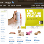
Mia & Maggie – Beautifully designed retail site with a clean & unique look. I really love how they’ve allowed their customers to upload pictures of their pups! Fun and personal, allowing them to really see who is using their products and/or wearing them. Using Magento, a popular e-commerce platform, Mia & Maggie is able to utilize many different built-in features, such as product zoom capabilities. As I touched on earlier, it is important to allow your customers to really get in close with your products. This helps to show off the quality of the materials used, in this case maybe a dog collar? Interested in seeing an example of how they combine their email campaign with the design of their website? Sign-up for their emails towards the bottom of the website.
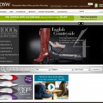
Edgy, sleek and effectively designed! Check out their email campaign too! Very consistent design across all marketing elements. A great marketing tool is a global header across the top of each page. This is the perfect place to include a promotion, sale, new product or any other element you think your customer has to know about. I especially love how their designer/s utilize different sized images on the women’s, men’s and handbag pages. Even though they each have a similar layout, they really pop and all have the same appeal. Very well done!
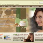
This website focuses in on the natural and active ingredients found in Aveeno products. The colors are chosen to fit the product design as well as merge with the photography. Even though they aren’t actually selling the products on this website, it offers details and highlights each product throughly. Since Aveeno is a high-end skin/hair care company, this route is appropriate. Cross-selling is also very effective online. Give your customers related products when they are viewing a product detail page. Saying, “You might also like”… Imagery is also beneficial in this case to capture their attention to similar products. Aveeno does this very well and even allows you to choose the type of skin or hair you have and it shows multiple products that would be appropriate for you and why. Very functional and smart!
Ease of Use
Design isn’t only to brand and give your website a personality. It has to be functional and easy to understand to be successful too. There are hundreds of different options when it comes to online retail. That doesn’t mean you need to use every single one on your website to make it successful. When working with your designer, make sure there is a reason for each element on the site. If it doesn’t have a purpose, then you probably don’t need it!
“The less elements your customer has to muddle through the better.”
For example, I don’t normally like to point out downfalls on websites, but this one really gets to me! I think the Aveeno design is beautiful, effective and focused, yet when it comes to ease of use, it scores low. When clicking on the Aveeno baby tab in the top navigation, I waited for what felt like a century for the page to load. There was no loading symbol to give me a clue that something exciting was coming. This seems to be the case on many of the pages. Load time is extremely important! Be aware of this and make sure your programmers and designers test and optimize their images to decrease load time. Lots of large images, video and flash = a slow, unhappy website > will lead to visitors leaving instantly.
Another important element is the shopping cart. Try and minimize the amount of steps/hoops your customer has to travel through to purchase a product. Make sure each step is simple and un-cluttered. You want this process to be as painless and straight-forward as possible. Don’t try and be tricky to promote a particular payment method by making others less accessible. This can cause your customers to become irritated and leave without completing the purchase. Simplcity is always key.
Here are a few great tips from the Web Design Depot 10 Tips to Design Usable Shopping Carts
Promotions
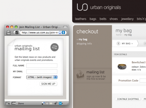
When doing some research into email campaigns, I came across this unique idea for an email sign-up. Often times businesses will send out both a text version and an image-based email. This is because many mobile devices don’t allow you to see imagery in your emails and/or when browsing the web (iPhone excluded). Urban Originals is asking which format you would prefer to view your email in, with images or without. I think this is a smart idea. Especially since the customer is requesting your information/products/promotions, it would be nice to give them the information in the way they would like to view it too! This would most likely increase sales and get the customers to look at your emails more often than not. Not everyone likes visuals over content, especially depending on what your trying to sell them.
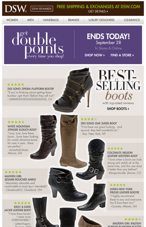
Email is a great way to promote your online retail store. Once you’ve got your website designed, try applying the same look to your email program. It is a great and inexpensive way to connect with your customers. For more information on email campaigns take a look at my post: Direct Mail Options: Print vs. Email Here is a great example of an email from DSW Shoes. They give the customer a benefit right away to why they are receiving their emails (double points). They also offer great reviews on their boots.
Looking for more great resources on retail design? Check out these other articles:
5 Tips and Tricks For An Effective eCommerce Site With 10 Brilliant Examples
12 Tips For Designing an Excellent Checkout Process
