Continuing with the Impact of Design series, I’d like to introduce our new addition with a focus on the travel industry. The travel industry is dependent upon many other industries to stay afloat, including: food, transportation, entertainment, hospitality and more. Many cities wouldn’t have income coming in if we didn’t have the ability to travel. Since this is such a large area of business, I’d like to discuss how design can help make it successful online.
Key Points of Design Focus
Exciting & Engaging Design Elements
When your viewing a travel website, what draws you into it to begin with? The colors, the way the images make you feel, the great prices displayed prominently? These are just to name a few. Whatever your business draw may be, your graphics should follow suit.
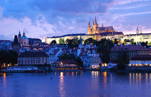
Prague Castle photo by mcos
For example, let’s say your travel website is focused on offering luxury castle stays in Prague. Your main focus is luxury and elegance. With your graphics, you want to make the site feel elegant and luxurious, the same way you want your customers to feel when they visit your castle. Show the details of the rooms, what their dining experience might look like, and any other elements that scream luxury. Use rich colors that allow these luxurious elements to take center stage. When listing the pricing, since this is probably a costly stay, be sure not to bring too much attention to it, but making sure it isn’t tough to find either. You might want to consider using a video that walks the user through a visitor’s experience at the castle. Allowing them an opportunity to see themselves at the castle. Finding the right balance and what is most and least important can be key when engaging your visitors.
Evaluating the Competition
How does your travel offerings and presentation compare with the competition? Before starting or re-evaluating your travel website, it’s important to see what others are doing first. Then, decide how you can do it better and more effectively and what you can add that they don’t offer. For example, let’s say Travel Company A has a really cool and engaging Flash application running within their website. It allows their customers to click on a map and highlights the best reasons to visit that particular destination. How can you take this idea and make it one step better?
Maybe graphically it isn’t very engaging as it is functional. Maybe you decide to showcase the best things to see in each area by using photographs alone within map pop-ups? Taking one more step to engage and intrigue the customer might make your business more successful.
Online Booking
Many travel sites have very intuitive booking systems that allow you to quickly book your entire vacation online in the comfort of your own home. With the many options that vacation packages can bring to the table, it’s important to focus on the user’s experience when designing. UI (User Interface) designers are specifically trained in improving a user’s experience by making the completion of one task as seamless as possible.
With travel, there are quite a few options to take into account. If you are running a business, which offers vacation packages with transportation, lodging and activities there are quite a few combinations that could be put together. Making those choices fun, simple and engaging to sort through isn’t always easy.
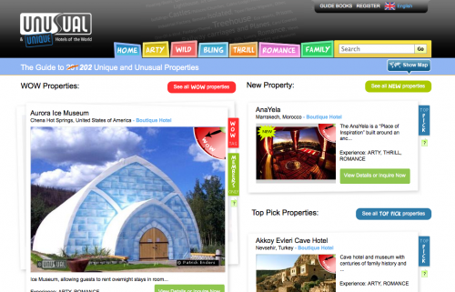
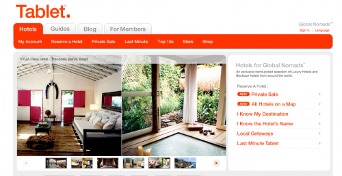
A great solution would be to group options by the type of travelers you commonly encounter. Such as the budget-savvy traveler, the luxury traveler, the extreme adventurist, the water lover, etc. Intelligently grouping certain options will help guide your users through your website and make booking a vacation just as relaxing as being on it! Here’s a great example of a website grouping unusual hotels by type:
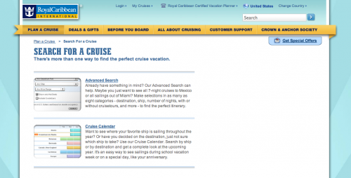
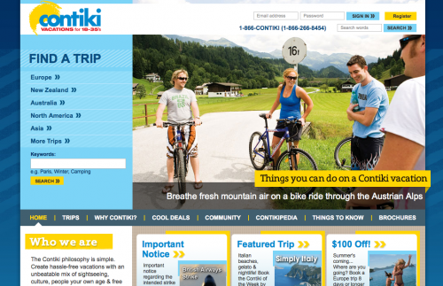
If your UI and/or web designer is able to test the site within a focus group, take advantage of that. It’s important when planning out a large, complex site with many options to test the usability with those that might be in your target market. This way you’ll find any glaring complexities right away before time and money has been put building a confusing, hard-to-follow travel site. Here are a few examples of Travel websites that utilize online grouping and booking systems effectively:
Online Booking | Royal Caribbean
Contiki Travel for Ages 18-35
Tablet Hotels | Hotel Search
Photography
When we’re talking about travel, most people want as many visuals as possible when they are spending their hard earned money on a vacation. When you haven’t been to a country before, you want to make sure it looks like a place you can see yourself enjoying. Keyword here is “see”. If you can only read about it, it probably won’t be nearly as appealing as a travel website who offers lots of visuals. This could cause your business to move elsewhere. When you show photography, give a description of where and what is happening in the snapshot. The more information you can give your customers the better. Display photographs of many different parts of the area and even some of the local residential areas. This helps bring the area’s culture to the mix as well. Food is also a great item to have on display. Many travelers look to try new cuisine and showcasing some of the region’s specialties could be a great crowd pleaser as well.
Up-to-date Photography
When your showcasing photography, make sure the photos are somewhat up-to-date. Many elements can alter an area’s appearances. You want to make sure your photographs are telling a truthful story and what they see is actually what they will get. Dating the photographs in the descriptions/captions might be a good way to be more upfront with your customers.
Email Marketing
During tough economic times, many consumers aren’t spending the money on vacations and extra, unnecessary purchases. A great way for your designer to help promote good value in the travel business is to design email promotions. Email marketing is a cost-effective way to reach your customers and promote your services at a discounted rate. Maybe you have a tough time selling trips to warm destinations during a particular time of year. Email is a great way to promote discounts easily and directly to your customers and design plays a big part in the success of these messages. When consumers aren’t out searching for a specific destination, photography in emails can be a great way to put these areas on showcase. Make the destination look it’s best and explain why the special offer should be taken advantage of. Just because your customer’s aren’t visiting your site, doesn’t mean they aren’t dreaming of a vacation. Maybe they can’t afford it or aren’t sure where they can go on a few dollars.
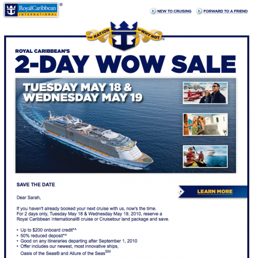
Here is an example of a promotional travel email I recently received that I found to be well done.
Intriguing Email Design/Marketing | Royal Caribbean Cruise Lines
/caption] Use design to promote the offer in an exciting manner that is also optimized properly for email. A great tip for your designer is to use both HTML text and images as shown in the above example. This way, if you customer doesn’t have images enabled in their email provider’s inbox view, they will still be able to see the special offer, enticing them to show the images. If you only use images in the email design, the efforts might not be as effective in this situation. For more best email practices and examples check out Email Designs that Will Rock Your Inbox.
Travel Website Resources from Around the Web
10 Best Designed State Travel Sites
37 of the Best Web Designs from the Travel Industry
Top 10 Designed Travel Websites
More from The Impact of Design Series
The Impact of Design: Restaurant Business
The Impact of Design: Online Retail
