Alas! The link.
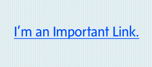
It can really take you places. If you make it visible, identifiable & pertinent. Remember the days when all links were bright blue and underlined? Those were the days. I know you’re probably thinking “what!?!” A designer wants bright blue underlined links? Yes. That’s correct. At least back then links were designed in a consistent, more user-friendly manner. When you saw a bright blue underlined link, you knew right away what it’s purpose was. Links are one of the most important elements on your website. They bring your visitors deeper into your site and allow you to take them straight to the content you think they are looking for. The come in many forms: buttons, text & images. They can look completely different in form, yet all have the same purpose. How do you increase the performance of your links?
Make Links Visible & Identifiable
How do you know if an element is a link without hovering over it or clicking on it? There should be some degree of consistency between the colors of your links. Whether you have text links, buttons or custom graphics or all-of-the-above it should not matter. Your visitors shouldn’t have to guess what elements are links. If they do, you might be directing them to the wrong places if they miss the links you intended they view first. Use the same color for all buttons, text links and graphics that suggest a call-t0-action. Your users need to know what to expect without moving their mouse.
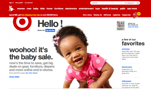
Let’s take a look at Target’s new re-design:
Welcome back bright blue links! We’ve missed you. Target has done a brilliant job of letting their users know exactly what is a link. The only exception is the navigation bar, which is less of a worry when it comes to color choices as long as it appears like a menu of links.
Target has moved from a mega-menu style navigation menu and taken the sub-category links to the left-hand column. They are providing less choices for their visitors from the homepage until they are in their category of choice. This allows for less user error. A mega menu has the potential to confuse users or bombard them with too many options. This is especially true if the categories are too narrow. The last thing you want is an overwhelmed customer who keeps clicking on the wrong sections because where you thought they might look for an item wasn’t correct at all.
How many times have you looked in the wrong aisle at the grocery store for a product? Imagine having that same experience, only without someone around to ask.
Links act as navigation no matter what the context is. Navigation menus are a party for links. It’s where they love to be and many can be found here. These links are some of the most important links on your site. If they are not pertinent to the content they direct you to, they are worthless.
Make Links Pertinent
The most common type of link is a text link. The link text needs to describe what will be displayed when the user clicks on it. A great way to learn what words you should be using is to gather data from your site’s search bar. The common words you find them typing in are called trigger words. These words help describe the content they are searching for in a nut-shell. If they aren’t seeing these so-called trigger words as links on the page, they will turn to search.
To improve your user’s experience on your website, try using these trigger words in the links you are creating. Take advantage of the data your users are providing to you via search.
Link Location
Your most desired content should be the easiest to find. Sounds simple right? But how do you figure out what content is the most important to your visitors? It doesn’t matter what you find most crucial. It’s about them. If you don’t already have Google Analytics or another site analytics software currently, I would suggest setting something up immediately. GA allows you to learn hundreds of things about your users, including what content is most important to them. If you do have a data program setup, you’ll want to determine what pages and links your visitors are clicking on the most. Once you’ve done that, it’s time to re-think the order of your main navigation and/or the prominence of these top-ranking pages links.
Always, always give the users what they want. Don’t give them what you want them to want.
Typically I’ve found that links on the left are more visible than on the right. Since English is read from left to right, this is typically how our eyes will take in the links. That’s not true for all languages as many Middle Eastern languages are read from right to left. So be weary of your site’s language too.
How does your site rate?
Are your links performing as well as they could be? Try walking through the following steps to determine if there are some things you can do to improve your visitors experience.
4-Step Link Audit
- Bring up your homepage. What color represents a link? (Note: Not “color(s)”) There should only be one, maybe two colors depending on the situation that represents a click-able link. This includes buttons, arrows and the basic underlined link.
- Are you underlining text that isn’t a link? Can you tell (without hovering your mouse) what is a link and what isn’t?Don’t underline anything that isn’t a link – Unless it’s absolutely crystal clear that it isn’t. (IE. Section borders and/or element borders or decoration). Try to avoid using your “call-to-action” color for other elements unless it’s obvious it’s not a link.
- When you click on a link can you make an educated guess as to what information you’ll receive when you click on it? Check your site’s search data and see what your customers are looking for. Use those top words to re-structure your links. Those words are what pops into your users head when they are looking for particular content.
- Are your links pertinent? Are you giving your link clicker the information they expected upon clicking? Check your site’s analytics and see what your top exit pages are. Maybe there is a reason these pages aren’t doing so hot. Perhaps the content they expected to find wasn’t there? Again, utilizing your site’s search data is a great way to pick-up on the content your users aren’t finding by simply clicking on the links you are providing them with.
Have other link tips that might benefit our readers? We’d love to hear it! Post your thoughts below.
This article was inspired by Jared Spool‘s presentation on “The Secret Lives of Links” during An Event Apart in Minneapolis, MN.


