
A Change Is Gonna Come
-Sam Cooke
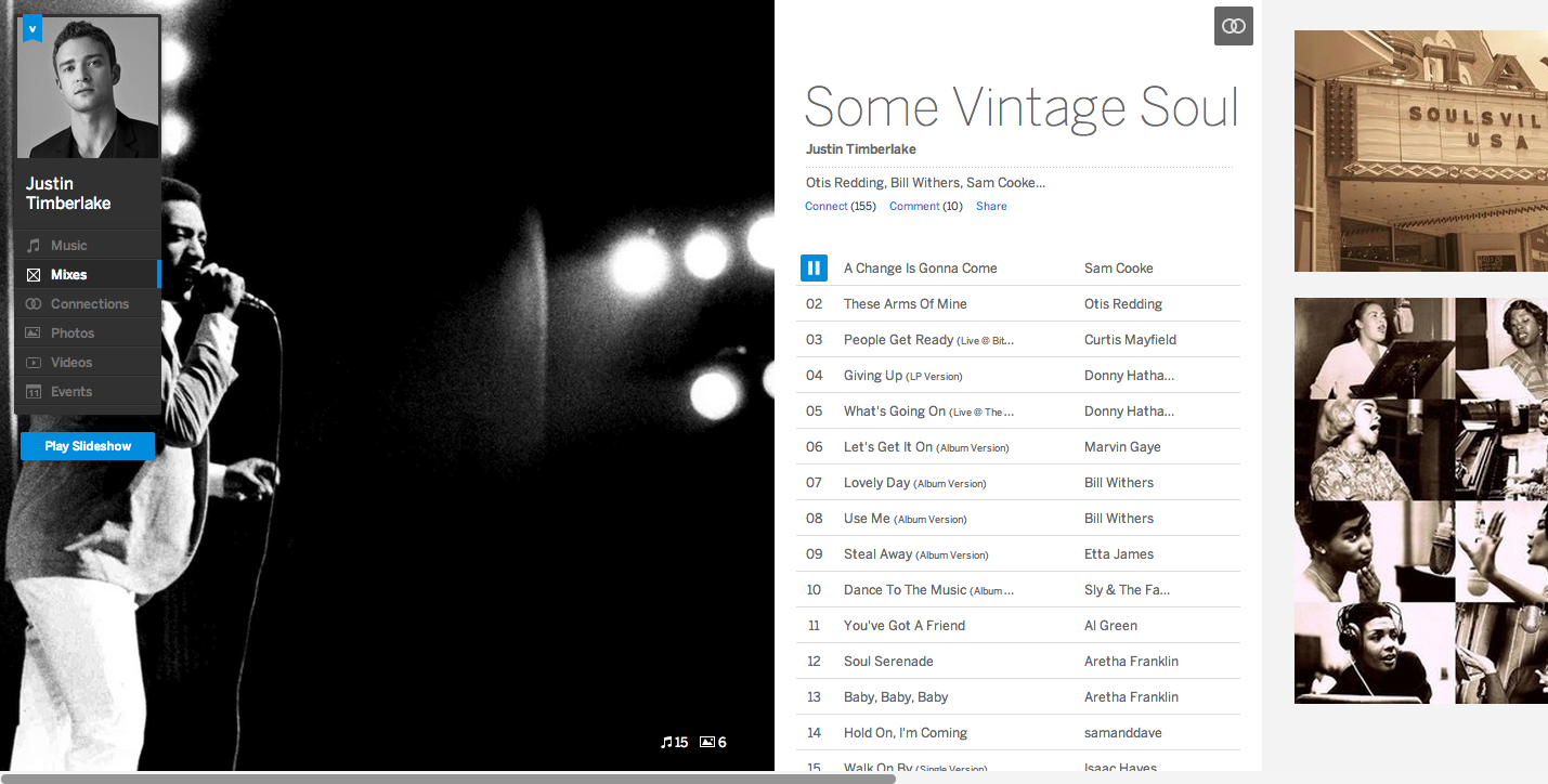
Mix List View
The New MySpace has gotten a lot of heat recently due to their new transformation. It’s being compared to Spotify, Pandora and as always, thrown up against Facebook.
Cnet writes, “It also doesn’t do anything that Spotify, Pandora, and Vevo don’t already do. I can get higher quality music videos on Vevo. I can bring my Spotify playlist with me wherever I go and use it offline. And Pandora’s had years to perfect its music algorithms.”
I’ve tried on all of these social media sites. I use Spotify on a daily basis. But have to deal with the audio ads AND the fact that it is a paid service if you want to take it offline. Facebook continues to add more features that make the experience miserable to use and take away features for businesses, unless you are willing to shell out a few bucks.
MySpace is clearly trying to be what it used to be known for. Music & creativity. The focus isn’t all over the place in my opinion. They do still have photos and albums, but this is needed for artists/bands. It’s clearly not as important as mixes or music connections. The profile directly relates to music is nearly every facet. Take a look at my profile below.
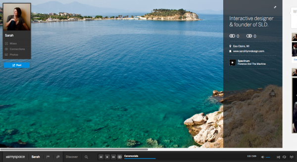
Profile Design
On the right you can add a profile song. The cover image is supposed to represent your creativity or for bands likely something that represents their music.
The left side gives you a space for a photo and shares your mixes, music connections and photos with others. Below is a snap-shot of my mixes. You can select a photo yourself for any mix you create or it chooses album art based on the songs you have in the mix.
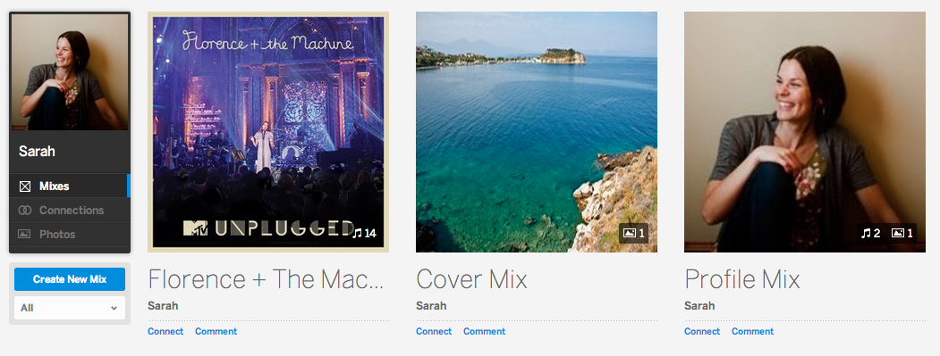
Profile Mixes
Benefits to MySpace over Pandora, Spotify & Grooveshark
- No need to download a program to listen to music (compared with Spotify)
- No audio ads to interrupt listening (compared with Pandora)
- Beautiful design (better than Spotify & Pandora)
- Social benefits encourage sharing mixes & discovering new music (Very minimal in Spotify (connects with Facebook) & pretty terrible in Pandora)
- Largest collection of music (compared with Pandora, Spotify & Grooveshark)
- No subscription required (mobile streaming costs $ on Spotify & Grooveshark)
Responsive Design
Below is a snapshot of my profile on the iPad. They’ve clearly thought through the new design and the mobile experience for tablets. It doesn’t look like they have placed any focus on the smartphone size media query quite yet. My guess is an update to their app is in order. They’ve considered which direction would be best for specific devices based on performance speed. Hopefully they will shortly offer a mobile version of the updated look that doesn’t include ads in between songs (audio ads).
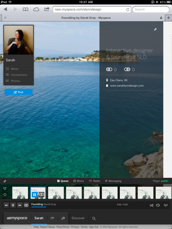
I’d really love to discover music by genre. Seems like a fairly obvious thing to want to do on a music based site. The genre panel is hidden behind my navigation on the left when using a tablet. Considering that this is the only issue I came across, for a big redesign in beta, not too shabby! I’ll be giving it a try for awhile.
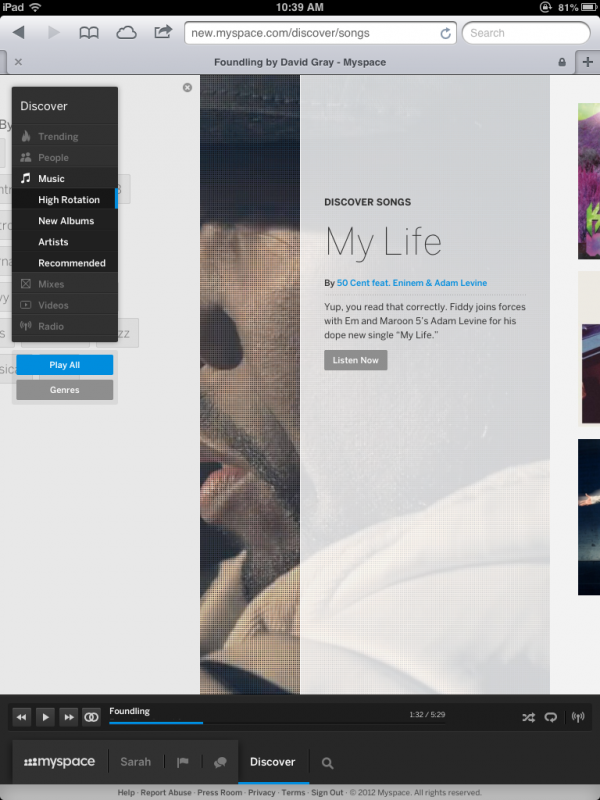
Genre panel hidden
What is your first impression of the new MySpace?
Share your thoughts in the comments…
