Every year, about this time, holiday marketing madness sets in. Your inbox is likely overflowing with emails from your favorite retailers. You eyes are being flooded with holiday sale commercials and ads left and right. How do you stand out in a sea of madness? You don’t have to offer huge discounts on Cyber Monday to sell more products. Here are some examples of what I have found to be some successful email designs & why.
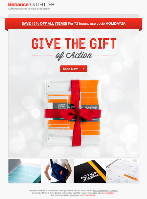
Above: Behance Outfitter focuses on the product and minimizes their special offer. It’s simple, clean and to the point.
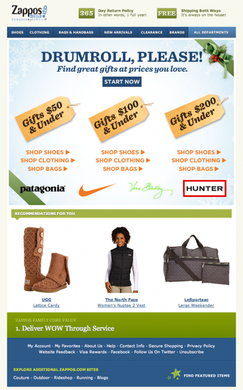
Above: Zappos has never been one to offer big discounts. Instead they focus on shopping by the price category their customers can afford.
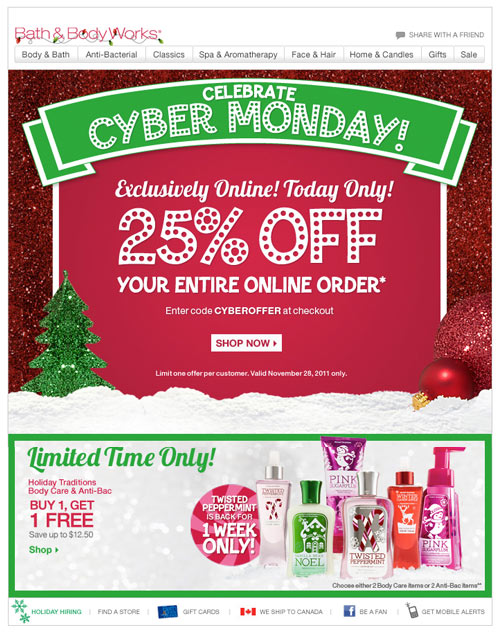
Above: Bath & Body Works is king of offering great deals year round. All that glitters is gold right? What girl doesn’t love a little shimmer in their inbox?
Emotional Messaging
Take advantage of how your products make your customers feel. Do they warm you up when it’s cold outside? Do they save you time at work so you can instead spend more with your family?
Always answer this important question: How can your products (or sale) improve your customers life?
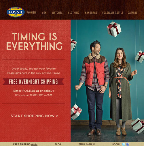
Above: Fossil uses time to connect with their customers.
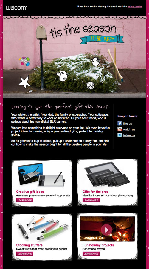
Above: Happiness is a great marketing tool. Who does love to doodle? Showcase how your products can impact your customer’s life. Offering deep discounts may work for large retailers, but that doesn’t keep your customers coming back for anything other than more discounts. Focus on products to build your brand.
Brilliant Color
Above: The streak of yellow pulls your eye directly towards the products.
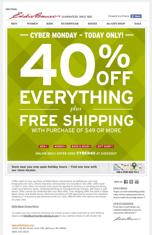
Above: This email was impossible to miss. Bright green and 40% off. Nice work Eddie.
Lengthy Email Designs
(shortened for example purposes) Long emails are a way for retailers to showcase many different products in chance that one of them will connect with the visitor. This can be successful especially around the holidays when customers aren’t just shopping for themselves. They may see something that wouldn’t normally catch their attention.
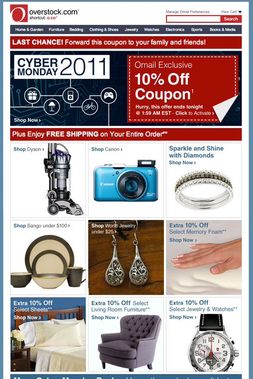
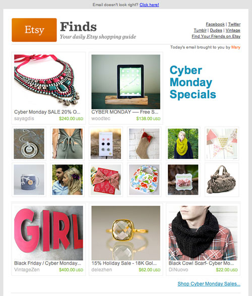
Above: Etsy kicks out long emails all year long since their users products have such a vast range in styles and type. You can select which types of products you’re interested in seeing in your inbox as well. Always a good idea when you are selling many categories of products.
Related Articles:
Email Designs That Will Rock Your Inbox 20 Cheery Holiday Gift Shop Designs (2010) Impact of Design: Online Retail
