It’s App Week! With so many great app designs popping up left and right, I thought I would share a few extras this week. Each of the presented apps are free too so you can explore them for yourself.
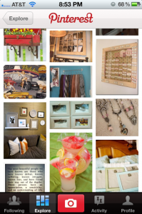
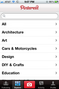
Pinterest is a great app if you’re looking for a quick dose of inspiration or some new ideas presented in a multitude of categories. Each “pin” consists of an image, title & description. You can browse other people’s favorite things, designs, crafts, cars, movies etc. in a visual fashion. It’s especially great if you aren’t sure what you’re looking for in the first place.
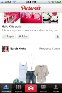
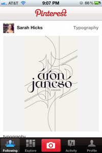
Why this Design Stands Out
This design makes the app incredibly simple to use. There isn’t an overload of features which often complicates apps. The use of a camera in the middle of the main navigation makes sharing new pins on the go easy and obvious. Many other photo based apps place the camera button in the middle as well. I think this is a good example of how familiarity can really benefit your users. The typography is clean and minimal which puts the focus on the imagery, where it should be.
iHeartRadio App
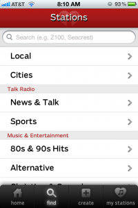
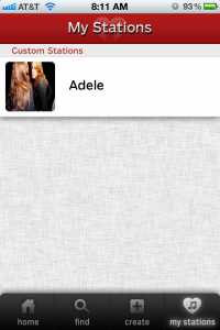
The iHeartRadio App has been in the back of my mind for quite some time. I hear it mentioned on my way into the studio nearly every morning. Thought it was about time I see what all the fuss is about. Turns out this radio app is absolutely fantastic! You can search for local radio stations and listen to them when you’re not near a radio. You can also tune into stations you may not get to listen to because they aren’t in your listening area. This is great for those who may have moved and miss their old radio DJs. It’s a step above Pandora and is incredibly fast. You can use their website version too, a great alternative to Pandora or Aol Radio.
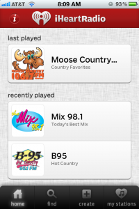
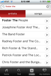
Why this Design Stands Out
Again, another example of a super simple app design. The iHeartRadio app is focused towards those on the go. You can easily access saved stations or browse for new ones by category, location or by related artists you already know you like. The linen texture behind some of the screens is beautiful on the iPhone. It reminds me a lot of the texture used in Apple’s Lion OS X. All of the buttons are big and easy to click on. The typography is clean and offers enough white space around each category, title and descriptions to make browsing easy on the eyes. The use of red in the app in minimal and only highlights specific categories and/or helps to show where you are in the app. Excellent use of a color for one purpose.
Jetsetter Travel App
Jetsetter is hot-spot for some of the world’s greatest vacation spots. Stunning photos of some of the most beautiful, picturesque places I have ever seen. This app is designed for those who are not shopping around for vacations on a budget. Prices are not at the forefront, instead these hot-spot’s amenities and high quality accommodations are showcased by way of large photographs and easy to scan descriptions.
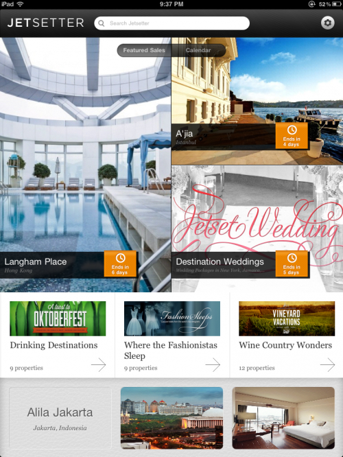
Above: Home screen is very visually engaging and allows you to view different locations simply by swiping left to right. You can view locations by category, by grouping or one at a time if you’re not sure where you want to go next.
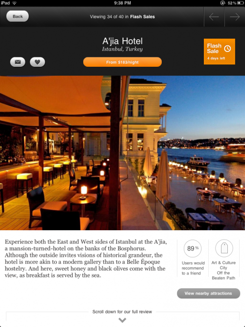
Above: Location detail page. Prices in the app are typically not show above the photograph, but on this particular page the price is shown in the orange button at the top.
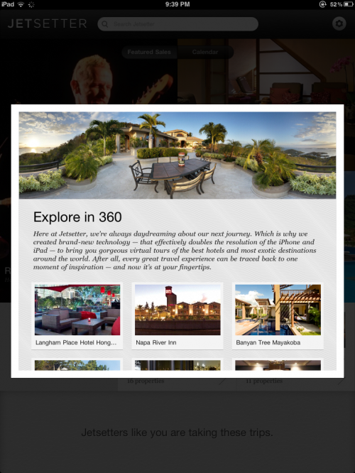
Above: Category thumbnail page. When browsing destinations by grouping (such as Explore in 360 or Wine Country Dwellers) you are taken to this screen allowing you to breeze through listings that you’re interested in.
Why this Design Stands Out
Overall, this app is heavily reliant on beautiful photography and an engaging design. The visual cues are spot on and it’s clear what everything does without the need for a help section or instructions. The textures vary from screen to screen and really add a lot to the design. Something about subtle textures makes an app more approachable and easy on the eyes. Texture also helps to differentiate the sections on the homepage and throughout the app. You’ll notice the browse by groups has a grey, swirled like background and other pages do not.
