Top Website Design of the Week
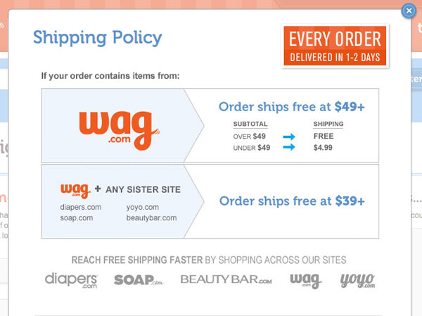
Wag.com
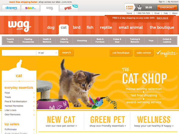
Above: Leaves symbolize green friendly products. Brilliant.
Why it Stands Out
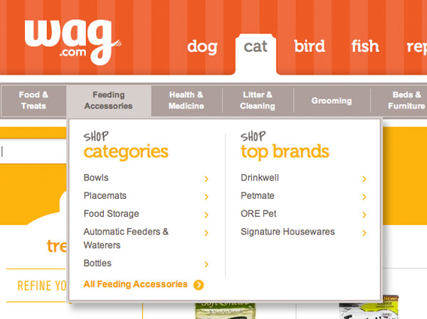
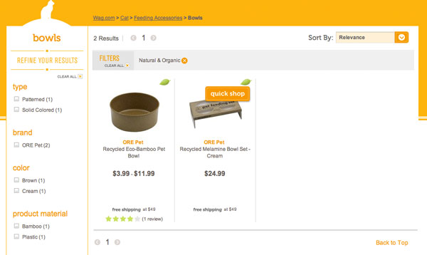
I can’t remember the time I saw a more cohesive, unique and usable e-commerce design. From the mega menu design & product refinements to even the pop-up window. Nothing is unaccounted for. Each type of animal has it’s own section and corresponding color. Even when you enter the sale tab you can shop by pet. The use of color dramatically increases the usability of the website when used in this fashion.
The only section that isn’t using these color conventions is the boutique center. In this section you’ll find products that are high-end and fashionable for that special cat or dog. The prices are much higher as well so it acts as like a whole other website in a sense. Another reason this site has a top notch design is the use of white space. They aren’t trying to cram 5 products in a row. Their designer has given each product room to breathe which really improves the design compared to other e-commerce sites.
Top App Design of the Week
Craigslist
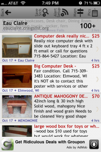

Craiglist Desktop vs. Mobile
The Craigslist App is an example of why thinking of a website in a mobile frame of mind can really be crucial to its success. There are many treasures and great deals to be found on Craigslist. One thing I’ve always shopped by is the photos. Who wants to drive somewhere to look at something they may not be interested in? The Craigslist App is great. You can immediately view the photos without having to click into the ad. It makes browsing much quicker and enjoyable.
The most important elements are being displayed on the overview page. Date, Location, Photo & Price. Although I thought the need to write about this app for Tuesday Talent, there are some confusing and unappealing aspects to this design. Since I last visited the app, they have updated some elements. One of those elements is the top navigation bar. The text is very hard to read at that size and orientation. The opacity of the city and # of items in the list view is distracting as well. It’s strange those top menu icons don’t carry through to the thumbnail view (above right). But it does looks great without them up there. Makes the design much less cluttered. Now if they only took this approach to their website. It would make the browsing experience that much better!
Why it Stands Out
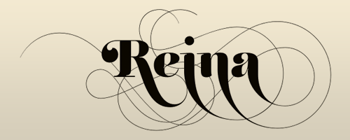
Reina is a beautiful font with both a classic and elegant feel. The stylistic alternates of this typeface make it exquisitely unique. It’s also available as a web font from MyFonts.
