Below you’ll find our weekly design favorites & why they stand out in the crowd.
Top Website Design of the Week
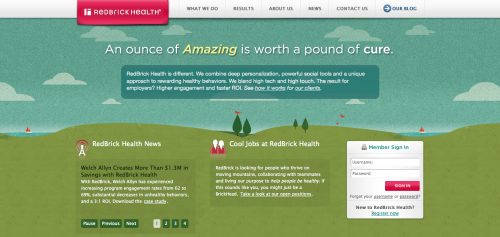
RedBrick Health
Why it Stands Out
When you think of employer offered health programs, they don’t typically sound very appealing or fun. RedBrick Health’s website design is approachable & casual. The content is organized in such a way that it’s easy to understand and to read. Finding the time to focus on your health and wellness can be tough, especially in today’s fast-paced work environments. RedBrick’s site is designed to explain exactly what they do and how they do it right from the start. There isn’t a ton of fluff to sift through. They showcase how they are different right from the start.
Top Responsive Site Design of the Week
Boston Globe
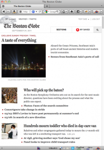

Above: (left) Homepage on web browser set at 600px width. (right) Homepage on mobile phone
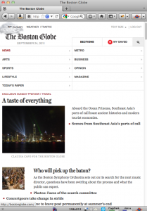
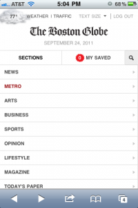
Above: (left) Navigation on web browser set at 600px width. (right) Expanded navigation on mobile phone
Why it Stands Out
Design is more than pretty graphics. It’s providing a solution that solves a problem. The Boston Globe’s problem was cross-device compatibility. Imagine managing three sets of content at the scale the Boston Globe manages. Responsive design allows the website to work seamlessly across multiple devices. Read more about the Boston Globe’s big re-design here: .Net Magazine: Boston Globe Responsive Layout Zeldman.com: Boston Globe’s Responsive Redesign
Top Mobile Site Design of the Week
Target
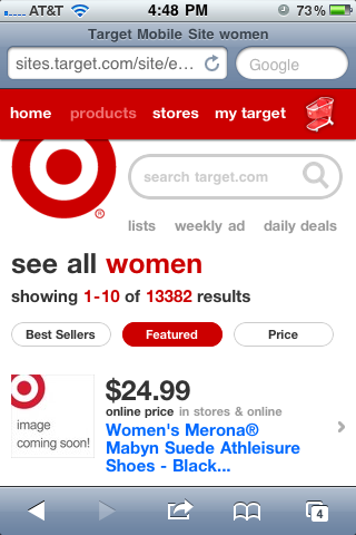
Why it Stands Out
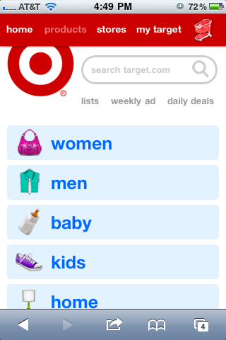
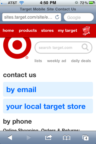
Only the essential elements are provided, in such a way that you aren’t left searching or scrolling for them. Every clickable link and button is large enough for even the biggest fingers to click. The contact page was designed in the most simplistic way. A great method for those on the move. Target’s long list of categories is easily recognized by the way the page information breaks at the bottom of the screen. The visitor can easily tell there is more information below by using this method. And finally, the way they use colors to signify links is exceptional. All shopping links and main links are blue. Secondary links are grey. And all sorts/buttons are red.
It’s consistent and allows their visitors to know what to expect on every page.
Top Font of the Week
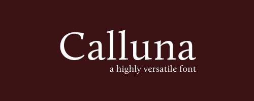
Calluna
Why is Stands Out
This desktop & web font is highly versatile. It works beautifully as a title font and reads well at small sizes. It’s classic and professional, yet approachable. An excellent tool for any designers font collection.
