Top Website Design of the Week
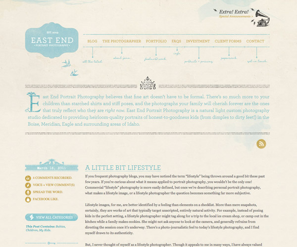
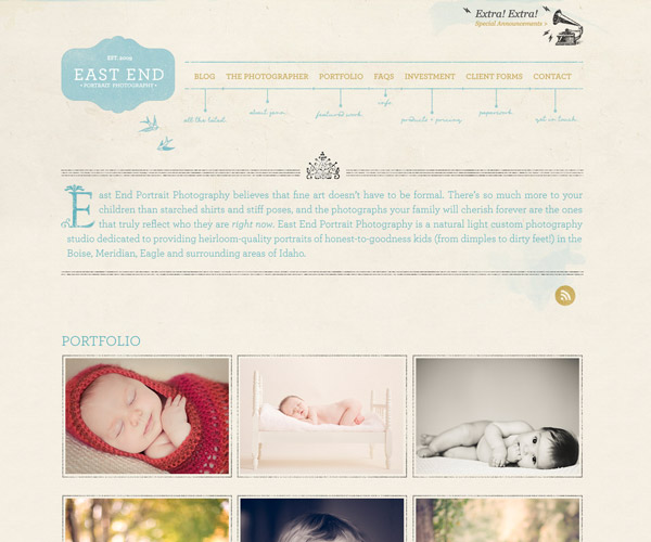
East End Portrait Photography
Why it Stands Out
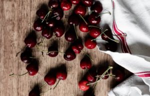
East End Photography’s website fits their work to a t. Every element is designed to feel vintage and long lasting. Memories are preserved through photographs and often reminds us of the past. This studios photography is very soft and old-fashioned feeling. It makes you want to dig up your old photos and reminisce. Not a single detail was overlooked. Great design & photography.
Top App Design of the Week
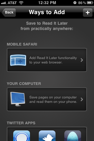
Read it Later
The home screen gives you everything you need in the simplest way possible from most important to least. Even the color palette highlights the most important elements, whereas the add, options and help sections are less visible.
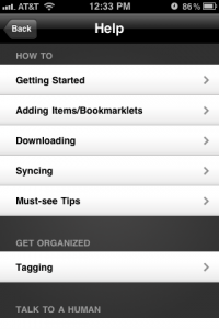
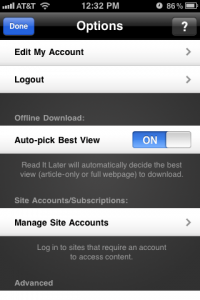
If you need help using the app, there is a help icon directly on the homepage. You can also reach the help section by clicking on the question mark in the options page. This particular help screen allows you to see tips pertaining to the options page only. Less information to wade through which is great. Give the users exactly what they need, when they need it. Brilliant.
Top Font of the Week
Sense
Why it Stands Out
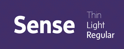
Sense is a casual yet professional sans-serif font that works GREAT on the web. It’s a multi-purpose font with many variations from thin to black. If you’re tired of the same old Helvetica or Arial on your website, it’s time for a change. If it makes “Sense” of course.
