Travel Website Designs Examples
Visit Orlando
Why it Stands Out
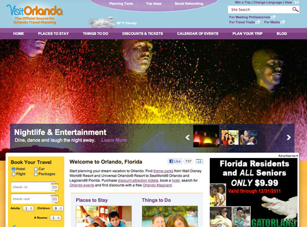
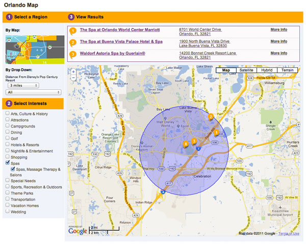
Orlando is known for its theme parks and family attractions. This site portrays that and then some. It’s fun, engaging and bright! Exactly how Orlando should be portrayed. Their interactive map is really easy to use and makes finding places by location a cinch.
Visit Maine
Why it Stands Out
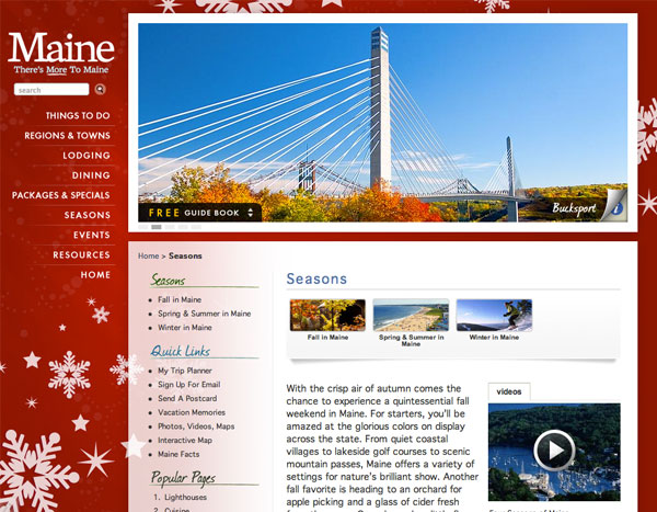
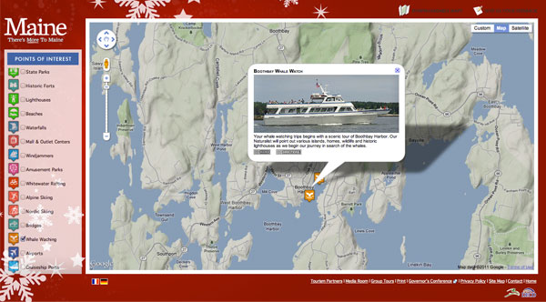
Maine’s travel website offers lots of helpful information along with listings of things to do and places to stay. They use small thumbnail images at the top of each page to help you explore different sections visually. The use of photographs for nearly every section/listing on the site is great! It immerses you into the state and makes browsing the site a lot of fun. The interactive map on this site is nicely done as well. Points of interest are broken down into categories and there are no distractions from the task at hand. For locating items on a map it’s helpful when it’s large. Especially if you are unfamiliar with the area, as many travelers tend to be.
Kansas City
Why it Stands Out
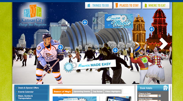
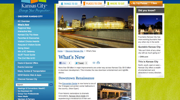
The concept of color coding things to do, places to stay and where to eat is a great idea. It simplifies the necessities for visitors in the top nav. The left navigation allows visitors to do more exploring. I do wish they carried the three colors into each section a little more. Even if a little bit of orange showed up in the image slider at the top of the Places to Stay section.
Minneapolis, MN
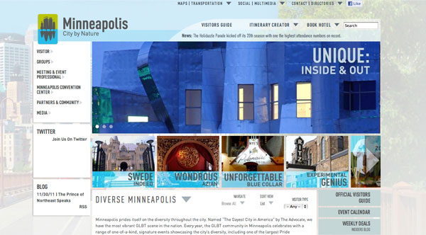
Even though it’s still in beta, there are a lot of very creative design elements happening. It’s a site that seems to be made for browsing and exploration rather than acting as a directory. The flow of the site feels more magazine-like. The use of photography on the site really makes this site fun to browse. It’s engaging and informative. The concept of separating city and nature is great since Minneapolis has many green spaces and isn’t far from thousands of lakes.
Las Vegas
Why it Stands Out
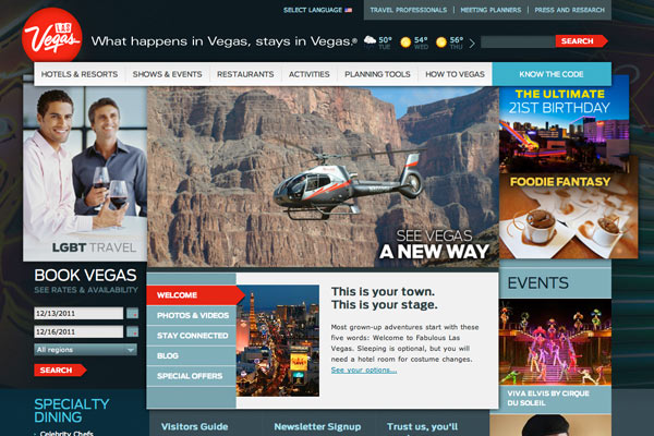
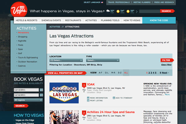
The use of color is incredible intelligent throughout this website. Red indicates links and important elements and is used sparingly. The shades of blues are lovely and contrast nicely with the red. The shadow along the left navigation helps to separate the navigation from the rest of the content. Typography is well done. There are a minimal number of fonts and the variation of size is spot on to help readers understand what is most important on the page. Overlapping elements are tricky to pull-off in development and this site rocked it!
