Top Website Design of the Week
Lancaster University
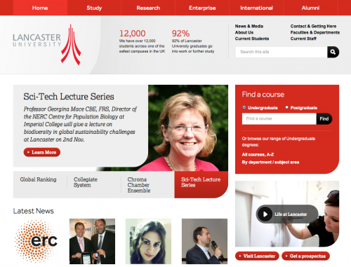
Above: Desktop Size 1024 x 768
Above: When moving from a desktop computer to a tablet sized screen resolution, you’ll notice the right-hand sidebar elements are shifted below the slider.
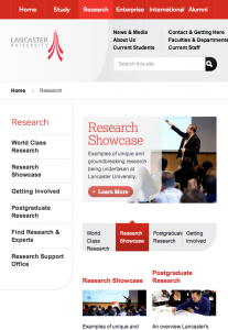
Above: As the site is viewed on smaller mobile devices, you’ll notice how the slider’s appearance changes, images are re-sized or removed altogether, and navigation is moved to the bottom since the user can already dive deeper into the site by clicking on the titles in the main content.
Why it Stands Out
Lancaster’s design & development team took this site to the next level. Using media queries, they created a site that is not only flexible and appropriate for mobile devices, but also is designed to be usable and smart. You’ll notice that the site is adjusted in the examples above when viewed in a smaller screen resolution. The sidebar items are moved below the main slider upon the initial size adjustment.
The use of red on the site was also executed successfully. It’s easy to tell what is a link and what is not. With over 50,000 different pages of content, the re-design of the University’s site will take quite some time to be completed fully. They aren’t letting size stand in their way. They are developing pages that haven’t been updated yet over time. Read about the website re-design or leave feedback.
Top App Design of the Week
This app is by far my favorite iPad app. It takes different feeds from blogs, websites & social media sites and re-formats the content into a magazine. You can easily flip through your favorite content as if it was in printed form. It makes browsing your favorite tweets much more enjoyable. My favorite part is the way the images are displayed. Instead of being hidden behind a link you have to click on first to see it, it’s displayed directly with the content.
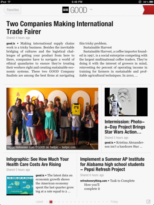
Above: Feed from @GOOD
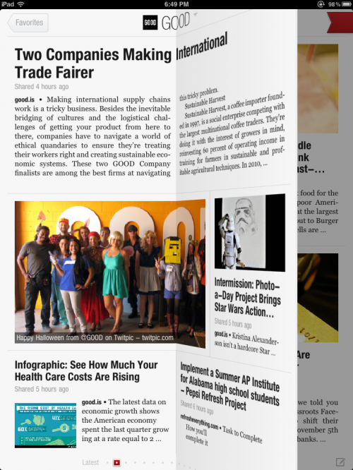
Above: Flip through your favorite feeds like a magazine
![]()
Above: Utility bar that shows below each article to allow you to mark your favorites, share the article on twitter (or Facebook if that is where it originally was shared) or reply to the original tweet and/or like the post. Once you’ve synced up your social accounts, sharing is easy!
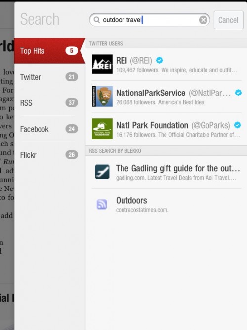
Above: Search for your favorite feeds or discover new content you may not be familiar with. Easy on the eyes and simple to use.
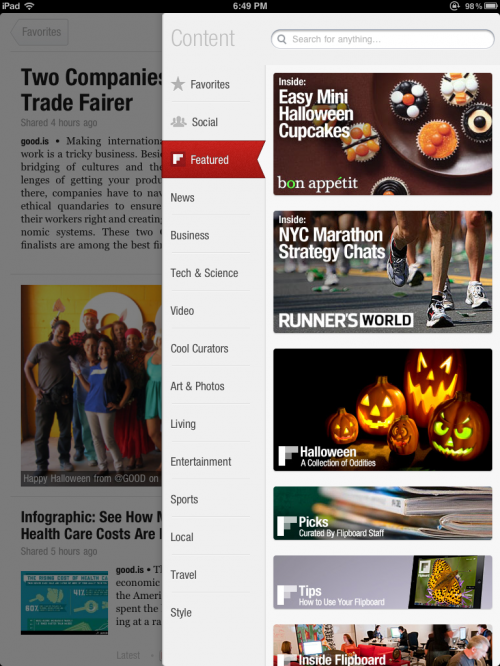
Above: Flipboard offers a table of contents with many top categories and custom Flipboards they’ve put together.
Why it Stands Out
Flipboard’s interactions are smooth and you don’t have to think to figure out how it works. The first screen shows you how to flip and once you learn that simple interaction, already learned by reading a printed magazine, you’re ready to go! The color red (I swear this isn’t a trend of this post, only by coincidence 🙂 ) is only used for the ribbon that pulls up your favorites and allows you to search for new content. It is also used for pagination, quite minimally, at the bottom of the screens. Any more design would overtake the content. Flipboard syncs with Read it Later or Instapaper and also Facebook & Twitter. This makes it easy to share your favorite articles or save them to read later on another device.
Capucine | Process Type Foundry
Why it Stands Out
The Process Type Foundry in Minneapolis puts out some beautiful fonts. Their fonts typically come with at least 4 different weights. Nothing beats a versatile font that can evoke a different feel with a simple change of weight. Capucine is brilliant! The bold style looks quite scripted whereas the thinner weights take on a completely different look.
