Top Website Designs of the Week: Wine
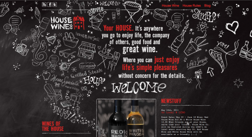
House Wine Co.
Above: Homepage reminds me of walking into a bar/restaurant and looking up at the specials board. Makes you feel as though your immersed in the website from the start.
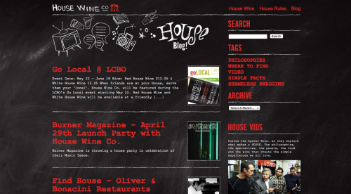
Above: House Wine Co. Blog
Why it Stands Out
This site is extremely creative and playful. The chalk board resonates well with this brand from their website to their wine labels. The red is used sparingly to represent a link or a title. The rough chalk borders around the images even make photos on this website cohesive to the overall theme. This is a great example of how social media can be integrated into the design of a website. It becomes a part of their brand, rather than Facebook and Twitter’s branding.
Top Website Designs of the Week: Organics
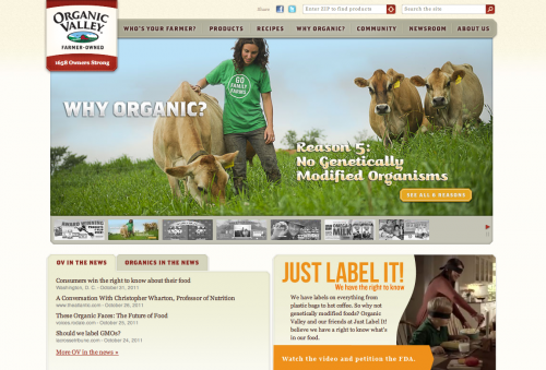
Organic Valley
Above: Organic Valley’s Homepage – Large photographs capture your attention from the start and scream organic and fresh
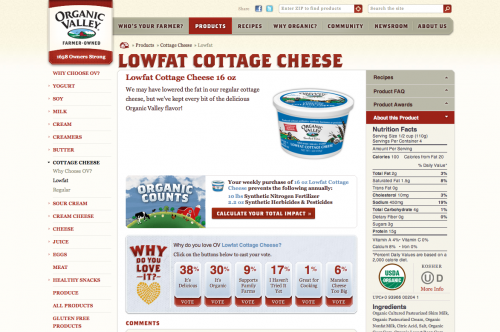
Above: Product page for cottage cheese – The “Why Do You Love It section” shows an awesome way to display customer feedback on a particular product without the typical star treatment.
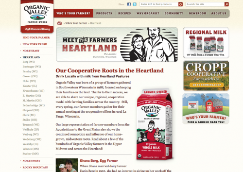
Above: Organic Valley sells different varieties of milk depending on the region. Above is an example of the Heartland (Wisconsin 😊 ) and they call out all of their local organic farmers. Great idea!
Why it Stands Out
Overall Organic Valley’s website uses appropriate colors to portray a fresh, organic & natural feeling throughout their site. The do a brilliant job at using emotion to connect with their viewers through photographs of families and happy animals in their natural environments. They offer articles and information integrated with their product pages to help their customers understand why organic foods should be supported and purchased. I think offering more information at the point of purchase will help inform and persuade buyers to purchase.
Horizon Organic
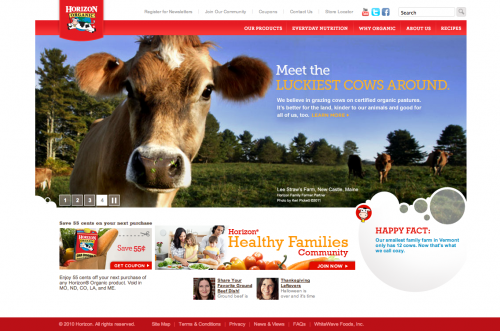
Above: Horizon Organic Homepage – The milk bubbles and immersive photography really give the impression of dairy from the start. There is no question what type of site you are on.
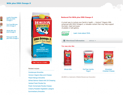
Above: Horizon Organic uses white space very effectively. The way their nutritional information rolls up is a great space saver yet is still very obviously accessible when needed.
Why it Stands Out
Again, we see another example of how emotion can play a crucial part in design. Throughout the site you’ll find helpful information about why you should purchase organics and more in-depth information about each product. The photographs show happy families, cows and smart products. In many of their featured product shots, they explain how the product can benefit you and/or how you can use it in your daily cooking. I find more and more companies who need to take an approach of focusing on how the products can improve the lives of their customers. Instead, many businesses are promoting the promotions more heavily than the products themselves. Which may be more profitable in the short term, but how do you keep your customers coming back
Door to Door Organics
A very unique company that sends you boxes of yummy organic foods based on your preferences or shopping list. Fresh foods straight to your doorstep. Above: Chicago’s Door to Door Organics site homepage
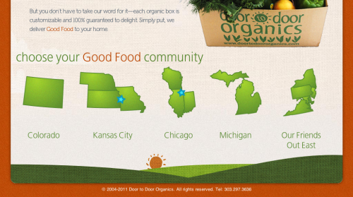
Above: Select your community using these great illustrative maps. You’ll then be taken to your community site to shop locally.
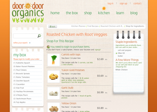
Above: Find the products you need for great recipes right on the site!
Why it Stands Out
Door to Door Organics’ website is very easy to navigation. The design separates the general shop section from the recipe section, both allow you to make purchases, but it different ways. The notepad paper on the sidebars helps distinguish certain information pertaining to lists and searches from the actual products in the middle. It breaks up the page nicely and makes sense for the information that is being displayed on top of the notepad paper. The textures throughout the site work wonderfully to portray a natural feeling. Illustrations help in many cases to explain how the business works, not just for decoration. Door to Door Organics makes shopping fun and easy and it’s clear from their website design.
