1. HouseTrip.com
Touch-Friendly Filters
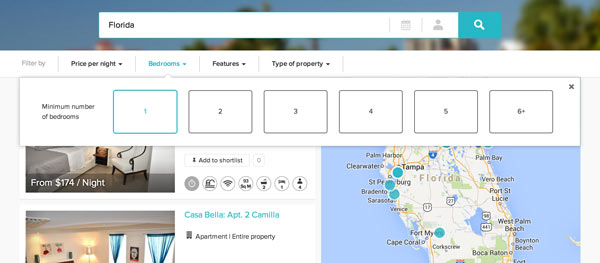
Large, touch-friendly filter options make it easy for a mobile user to refine their house selections. Don’t forget, not all of your visitors are using a mouse to navigate your site. They also have varying sizes of fingers too! Make your interactive elements large enough so your visitors aren’t struggling to filter your properties.
Easy to Use User Interface
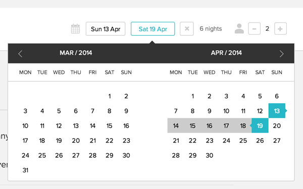
Selecting dates on a calendar can be cumbersome. HouseTrip makes it easy by indicating with a right or left pointer the check-in and check-out dates and automatically calculating the # of nights you’ve selected. What other items can you automate for your users so they don’t have to take unnecessary steps?
Neutral Website Design
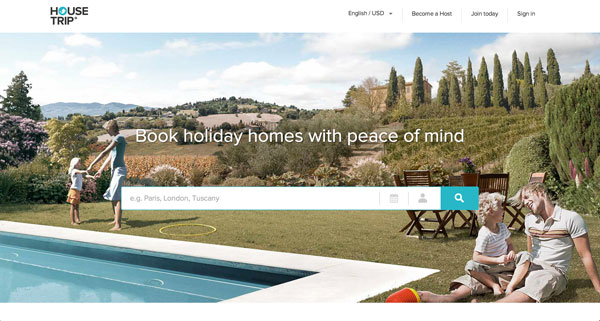
Vacation rental sites are typically driven by photos. Keeping the website graphics and background colors neutral will allow the photography to speak for itself and carry the properties. Consider investing in better photography if you are looking for ways to encourage visitors to browse your homes.
Follow House Trip on Twitter: @HouseTrip
2. Luxury Retreats
Incorporate Travel Guides with Property Listings
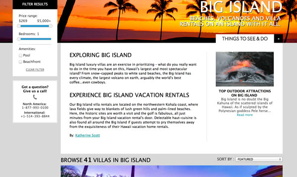
Make it easy for first-time visitors to find interesting things to see & do near your available properties. Luxury Retreats does a great job making browsing properties still easy while having access to trip ideas all in one place.
Follow Luxury Retreats on Twitter: @LuxuryRetreats
3. Oliver’s Travels
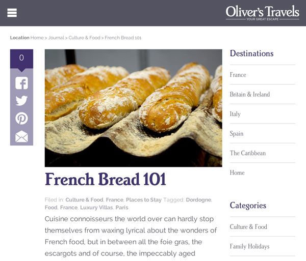
Responsive Design & Readable Typography
Oliver’s Travels, a luxury villa rental business, does an excellent job of providing additional value to their visitors with their blog. They use a excellent size font for their blog to make reading enjoyable. Their website is also responsive, taking into account mobile visitor’s needs as well as others.
Follow Oliver’s Travels on Twitter: @olivers_travels
What other sites have you come across that you’ve found to be enjoyable to use or that have a unforgettable design?
