Highly Visual, Step-by-Step Forms
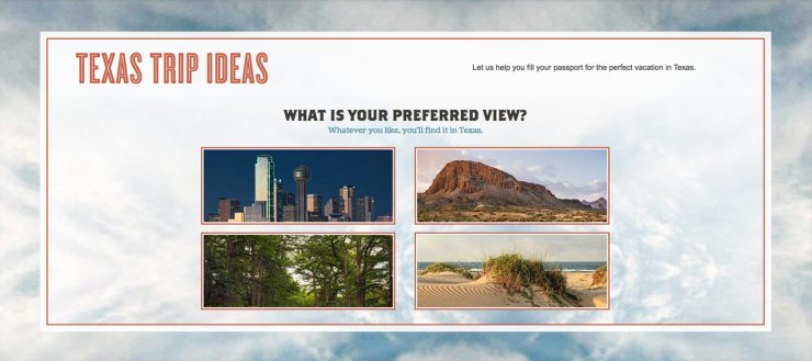
TravelTexas uses a visual form to help visitors discover Texas destinations.
Forms are often the first point of conversion on websites for many businesses. They have been studied in-depth over the years but haven’t changed all that much. This past year, I have begun to see more visual ways to gather more information from users.
In the above example, TravelTexas uses imagery to learn more about the type of trip their visitor might be best suited for. They are asked one question at a time and the answers are highly visual in comparison to the typical text fields we often see on websites.
Forms like this are a joy to fill out. It feels more like a game than work.
They aren’t necessarily suited for every industry or use-case, but are something you may want to consider if you only need to ask your visitor a handful of questions.
Look out for more visual ways to get information from website users in 2017.
Website Animation
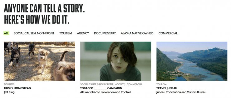
Channel Films uses a subtle sorting animation for their portfolio. Try it.
You’ve probably experienced some sort of CSS animation while visiting a website this year. Chances are you didn’t even realize it was happening.
Website animation has become more and more prevalent.
In the above example, Channel Films uses a subtle sorting effect to confirm the video examples have changed after the user selected another category of videos. Instead of loading a new page for each category, this effect makes the sorting feel faster too.
Some of the reasons you might use animation on your website include:
- To make a website feel faster
- To confirm a user action
- To delight
- To bring attention to notifications and messages
But just because you can, doesn’t mean you should. I believe there should be a sound reason for everything you decide to do on your website. Fancy effects can distract your visitors if not used in a purposeful way.
Look out for more website animation in 2017.
Evolved Mobile Navigation
We’ve all seen and used the “hamburger” button when interacting with a mobile website. Are we using it simply because it’s been the trend? You may not be able to show all of your top level pages on a small screen, but there are certainly more user-friendly ways to do it – without hiding too much.
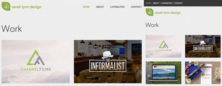
If you have a small number of links there is no need to hide them at all.
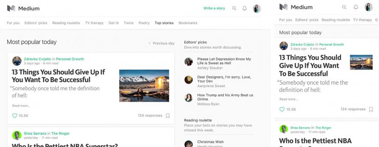
Medium uses a side-to-side scrolling approach to their mobile navigation.
Studies have shown you should try to avoid hiding all of your navigation under a single menu. The more you show, the faster your users may explore your site and gain an understanding of what you have to offer. The longer it takes any visitor to figure out your website, the higher the chance they’ll go elsewhere.
But, in design, there is a use case for everything. 2017 may bring some new alternatives to mobile navigation.
Transparency & Authenticity
This isn’t a direct design trend, but it does affect the visuals we see on the web. Many companies are choosing to be more transparent when sharing how they run their business.
Our imperfections are what makes us human. We all want to buy from other imperfect, yet trustworthy companies. The more we know about them, the easier it is to trust that they’ll come through for us.
Buffer has gone so far as to dedicate an entire section of their website to transparency. It’s one of their core values.
One of the changes in design I have seen more frequently is getting away from highly photoshopped imagery. It certainly hasn’t gone away, nor will it ever, but it’s certainly appealing to many to see the real thing more often.
I’m a huge fan of the Gilmore Girls. Netflix recently picked up the show this year and released four new movies. The promo imagery they put out of the two leading stars were so heavily photoshopped that hundreds of fans were more focused on how fake they looked rather than being excited for the show.
In 2017 I’m predicting a bigger shift toward authenticity and imperfect photos as well as content.
New Technology: Virtual Reality
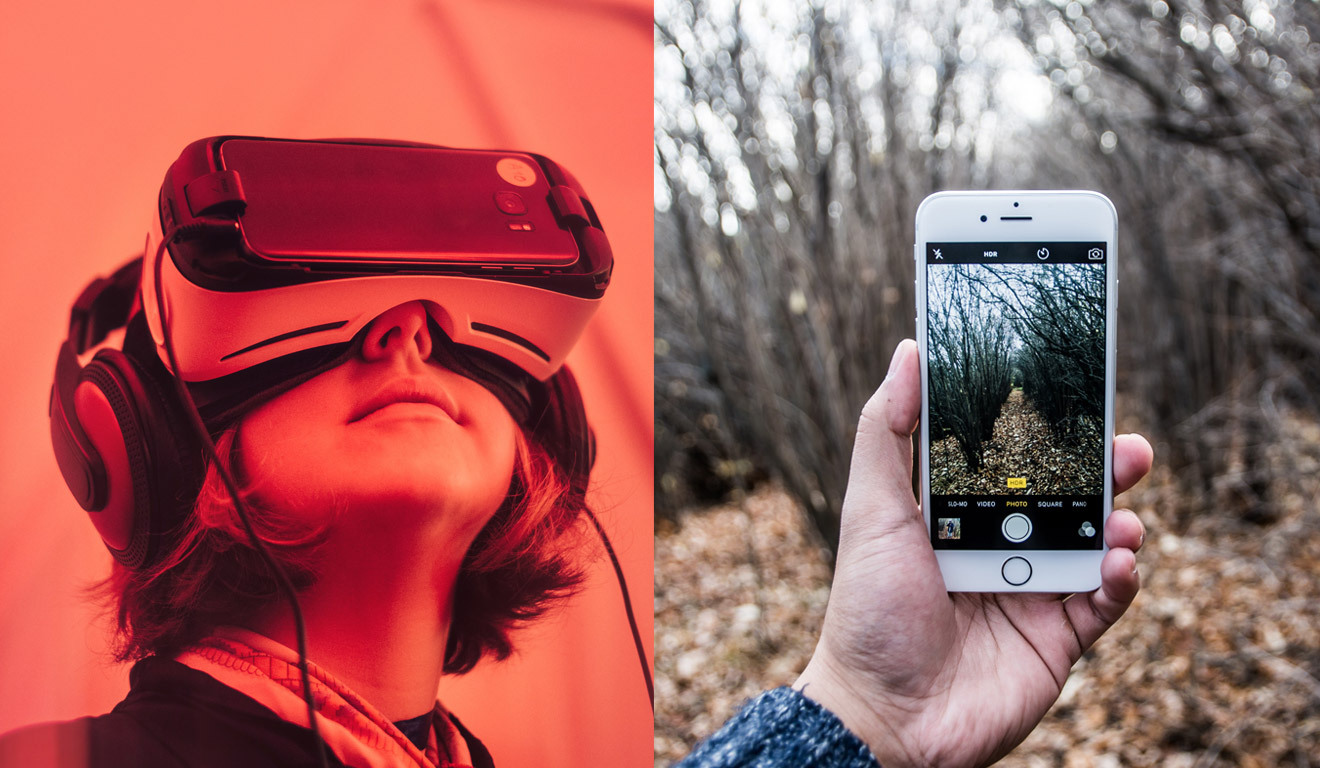
You’ve probably seen a handful of ads this past holiday season of family’s sitting around with phone’s strapped to their heads. Virtual reality has started to make its way into our homes.
What exactly is virtual reality? And how can it be used in business?
CNET put together a great guide on VR to help explain along with a round-up of experiences you can check out for yourself.
This year we’re going to start seeing more and more businesses utilizing the amazing capabilities of virtual reality.
I can’t wait to see where 2017 will take us!
