How do you decide if a design is successful or not? If you don’t have experience working with a designer or as a part of a creative project, you may have no idea. There are many different elements that can make or break a design. Simply because a design is original, pretty, colorful or even easy to read doesn’t mean it has succeeded or has met the goals of the project. There is so much more to design than meets the eye.
Great Design is Invisible.
Let’s go through some of those key elements as they pertain to website design.
Focus
What’s most important to your business?
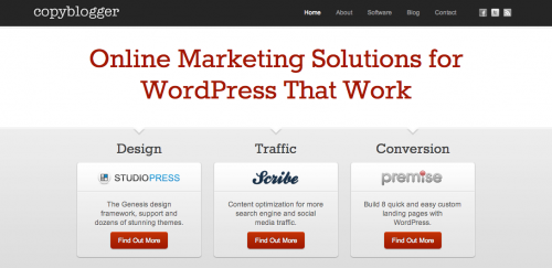
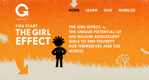
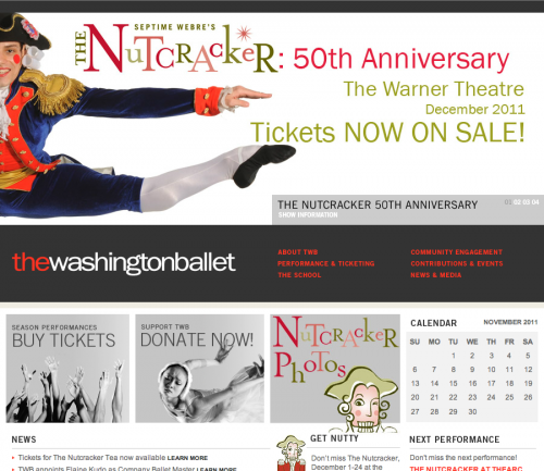
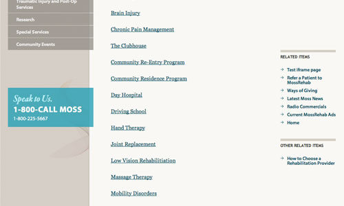
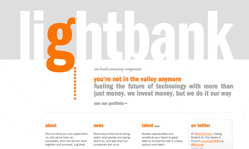
A great design should reflect and enhance the things that are most important to your business. The homepage should be designed in such a way that showcases what you do and why someone should care. If your visitor can’t figure out what you do from the homepage, then you may need to consider updating your website. Here are a few examples of homepage’s that have a clear focus and tell you exactly what the organization is all about:
Color
Use color in all the right places
Color can make or break a design. If you use the wrong colors, depending on the culture of your target audience, you could even offend someone. Different colors have certain meaning behind them. (See: Color Meanings Chart) There are reasons you don’t find too many bedrooms painted bright red. Color has an incredible affect on how we perceive things. Color can be used to callout elements you want your visitors to focus on.
Examples of Using Color to Provide Focus
Use one color specifically for links and buttons. Since links are the only way to get around on a website it is imperative that your visitor understands what is a link and what isn’t.
To make these all important links stand out, the color should be somewhat contrasting from the other dominant colors on the site.
Typography
Not just beautiful fonts. Appropriate fonts.
Typography is something that is constantly underrated and overlooked. It is one of the elements to a design that is the hardest for businesses to describe or callout as being the reason why they don’t care for a design. The size, weight, letter spacing, capitalization all can change the feeling a particular typeface gives off. Here are a few examples of how certain fonts can give off a particular feeling:
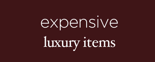
Thin, sans-serif fonts that are crisp and light can work great for expensive products. Serif fonts (bottom) can also give off a luxury feel.
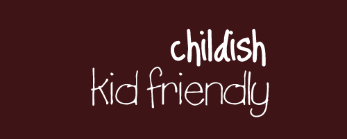
You’ll notice both of these childish fonts have letters that may be titled just slightly from the next. The bottom of each letter (baseline) doesn’t fall at the same point creating a more friendly, playful feel.
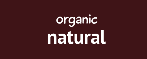
These organic fonts are both quite heavy and somewhat rounded.

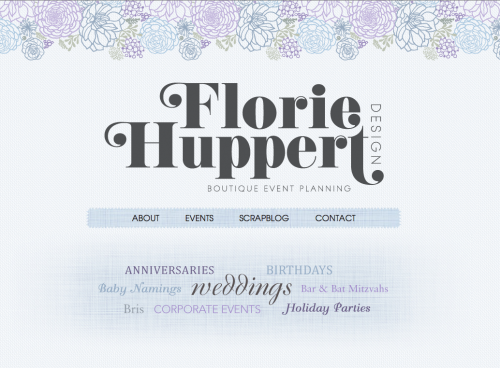
Script fonts are often times appropriate for formal events. It’s best to choose a font that is easily readable as well. This is the challenge of working with scripted fonts.
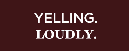
Writing in all caps can feel like your yelling at your visitors. It can be appropriate if used for a heading of a particular section if done properly. But it’s a safe bet to avoid using all caps for longer passages of body text. If something isn’t feeling quite right with a design you are presented with, think about the fonts too. It’s often the problem when you may overlook it.
Here are some great resources for learning some terminology on typography:
 Typography Deconstructed Typography Deconstructed |
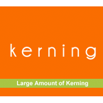 Design Principles 101 Design Principles 101 |
Margins & Grids
Interesting, yet consistent alignment
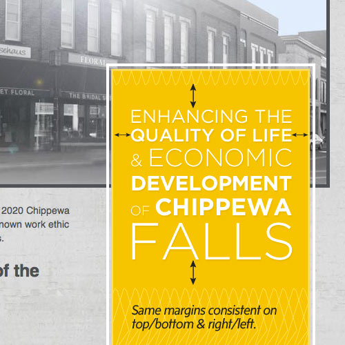
A margin is the space around the outside of an element. It’s often distracting to the eye when the margins of an element are not consistent. Here are a few examples of this done successfully.
Example of Consistent Margins
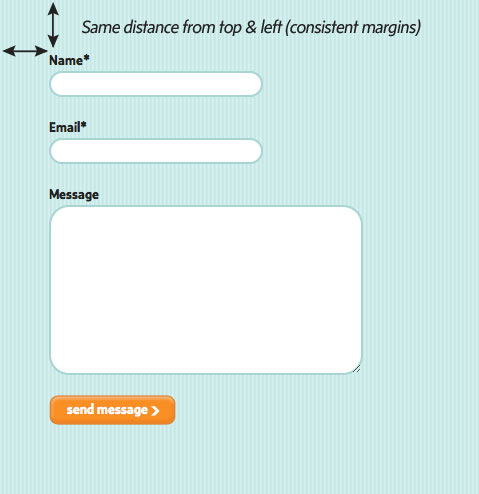
Example of Consistent Margins
A great website design generally makes use of some type of visual grid. This grid helps to align the elements on the page in a specific way to make the website feel cohesive. Grids can be very simple or complex depending on the content and type of website.
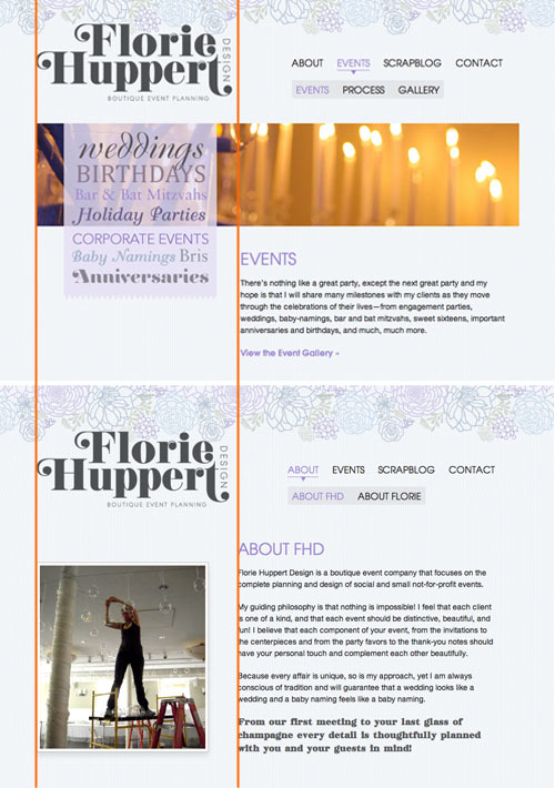
Example of Simple Grid
Think of a grid as the underlying structure to your website. In the example above, you’ll notice how the image on the first page spans the width of the main column, whereas the bottom page has an image to the left. A grid doen’t mean you have to have the same type of elements in the same spot on every page. A grid is a simple way to align and organize the different types of content on a page, not necessarily restrain you from adding variety to different pages.
Details, Details, Details
Textures & shadows
If you’ve surfed the web at all in the last few years you’ve probably come across a site with beautiful textures & shadows that made all the right elements come forward on the page.
Examples of Beautiful Texture Usage:


Examples of Successful Shadows:
The End Result: Great Design
All of these elements properly put together can produce a great design. If your working on a web project and aren’t sure what you should be looking for, use some of these key elements as a guide.
Looking for more design inspiration?
Checkout my Gimme Bar Collections
The Importance of Links
Online Shopping Usability: The Role of Color
Top Web Design Picks: Wine & Organics
